As a restaurant owner or designer, one question must be popping into your mind: What restaurant menu design mistakes should you avoid? Creating an effective restaurant menu seems simple, but many restaurant owners make costly mistakes that hurt their profits and customer satisfaction. Furthermore, a poorly designed menu can confuse diners, slow down ordering, and ultimately damage your restaurant’s reputation.
In this comprehensive guide, we’ll explore the most common restaurant menu design mistakes and steps to avoid them and create a more appealing menu that tantalizes your diners’ taste buds and leaves a lasting impression.
Why Does Good Menu Design Matter in a Restaurant’s Success?
Good restaurant menu design plays a very important role in a restaurant’s success. Additionally, it acts as a powerful marketing tool that directly influences customer behavior and purchasing decisions. Studies show that well-designed menus can increase sales by up to 20%. Moreover, your menu creates the first impression of your restaurant’s quality and brand identity.
Here’s why good menu design matters:
1. First Impressions Count
When customers walk into a restaurant, the menu is often the first real interaction they have with your brand. Even before tasting the food or speaking to a server, they form opinions based on how the menu looks. A well-designed restaurant menu creates a positive first impression, while a cluttered or outdated one can make customers question the quality of your food and service.
2. Boosts Sales and Profit
Good design isn’t just about looking pretty. It’s also about guiding customer behavior. Smart menu design highlights high-profit items, popular dishes, and special combos. For example:
- Use of boxes or icons to draw attention to bestsellers
- Bold fonts or colored backgrounds for high-margin dishes
- Limited use of currency signs to reduce price focus
These small design tricks encourage customers to spend more without feeling pushed.
3. Makes Ordering Easy
A well-designed menu makes it simple and stress-free for customers to choose what they want to eat. When the layout is clean, organized, and easy to follow, people can quickly scan the options, understand what each dish includes, and decide without feeling overwhelmed.
- Use clear and easy-to-navigate sections
- Using a font that’s easy to read in the right size ensures that customers of all ages
- Short, clear, and tempting descriptions help customers understand what each dish is.
- And more such steps, we’ll talk about later in this guide
4. Enhances Brand Identity
A menu should match your restaurant’s theme. A fine-dining restaurant needs a sleek, elegant menu, while a playful café can use colorful fonts and fun graphics. Consistent menu design helps reinforce your brand and tells customers what to expect.
For example:
- Rustic fonts and earthy colors suit a farm-to-table restaurant
- The minimalist layout works for modern or high-end restaurants
- Bold visuals and illustrations work well for casual dining or fast-food
5. Helps With Upselling
Menus designed with strategy can promote sides, add-ons, and drinks. For example:
- “Add cheese for just $0.5 more.”
- “Pair your meal with our house special mocktail.”
When these suggestions are placed near the main dishes, customers are more likely to say yes, leading to higher sales per table. A well-designed menu helps restaurants attract more customer attention, explain their offerings, and persuade customers to order more.
If you’re sure about how your restaurant menu should look and what elements it should include, you must explore the library of free menu templates that follow all design principles and help you create one for your restaurant.
What are the Most Common Restaurant Menu Design Mistakes?
Making a few mistakes while designing a restaurant menu can either improve or break customer satisfaction. Avoiding certain pitfalls can make a significant difference in how your menu is perceived and can directly affect your restaurant’s success.
Look at these mistakes to avoid when designing a restaurant menu, and improve your design.
1. Overcrowding Your Menu with Too Many Options
One of the biggest mistakes restaurants make is offering too many choices. Consequently, customers experience decision fatigue when faced with overwhelming options. Research indicates that menus with 7-10 items per category perform better than those with 20+ options.
Problems with oversized menus:
- Increased food waste due to unpopular items
- Higher inventory costs and complexity
- Slower kitchen operations
- Confused and frustrated customers
- Longer decision-making time
Solution: Get the right menu size, and keep it focused. Offer a smaller selection of dishes that are easy to prepare, consistently good, and represent your brand well. Similarly, limit each category to 5-8 carefully chosen items that represent your restaurant’s strengths.
2. Poor Typography and Font Choices
Typography might seem like a small detail, but in menu design, it plays a big role in how customers read and understand your offerings. Also, it can make your menu difficult to read and unprofessional. Many restaurants choose decorative fonts that look attractive but sacrifice readability. Furthermore, using multiple font styles creates visual chaos.
Why Poor Typography Hurts Your Menu?
- Hard to Read: Fancy, overly decorative fonts may look stylish, but are often difficult to read, especially for older customers or those with poor vision.
- Too Small or Too Big: Fonts that are too small strain the eyes, while fonts that are too large make the menu look childish or unprofessional.
- Lack of Contrast: Light-colored text on a light background—or dark text on a dark background—makes it hard for customers to read.
- Inconsistent Styles: Using too many different fonts across the same menu (bold here, cursive there, all caps somewhere else) creates a messy, unorganized look.
Best practices for menu typography:
- Use clear, legible fonts like Arial, Helvetica, or Times New Roman
- Maintain consistent font sizes (minimum 12-point for body text)
- Ensure high contrast between text and background
- Limit yourself to 2-3 font families maximum
- Use bold text sparingly for emphasis
3. Neglecting Visual Hierarchy and Layout
Not all dishes are equal in terms of profit or popularity. But if every item on your menu looks the same, customers won’t be guided toward your best or most profitable items. A well-structured menu guides customers’ eyes naturally through the content.
However, many restaurants fail to create a proper visual hierarchy, making their menus confusing and hard to navigate.
Elements of good visual hierarchy:
- Clear section headers and categories
- Logical flow from appetizers to desserts
- Proper spacing between items
- Strategic use of white space
- Consistent alignment and formatting
Layout mistakes to avoid:
- Cramming too much information on one page
- Using inconsistent spacing between items
- Poor organization of menu categories
- Lack of clear visual separation between sections
- Random placement of items without logical flow
Recommended: there are menu layout designs for restaurants you must check out, and follow the ideas to improve your layout and visual hierarchy
4. Ignoring Color Psychology and Branding
Colors significantly impact customer psychology and appetite. Nevertheless, many restaurants choose colors randomly without considering their psychological effects or brand consistency.
Color psychology in menu design:
- Red stimulates appetite and creates urgency
- Green suggests freshness and health
- Blue can suppress appetite (avoid for most restaurants)
- Yellow creates happiness and energy
- Black and gold convey luxury and sophistication
Branding considerations:
- Match your menu colors to your restaurant’s interior
- Use colors that align with your cuisine type
- Maintain consistency across all marketing materials
- Consider your target demographic’s preferences
- Test color combinations for readability
By considering the right typography and color combinations for menu design can make it visually appealing and tailored to customer preferences
5. Pricing Strategy Mistakes
A bad pricing strategy and format is one of the most overlooked menu design mistakes, but it can seriously affect how much customers spend. The way you display prices on your menu can influence what people order, how they feel about value, and even whether they view your restaurant as affordable or expensive. How you display prices can significantly impact customer spending.
Unfortunately, many restaurants make pricing errors that reduce their average order value.
Common pricing mistakes:
- Using dollar signs ($), which emphasize cost
- Aligning all prices in a column (makes comparison too easy)
- Using different price formats inconsistently
- Highlighting prices more than food descriptions
- Ending prices in .99 (appears cheap and fast-food-like)
Effective pricing strategies:
- Embed prices within descriptions
- Use consistent formatting without dollar signs
- End prices in .00 or .95 for upscale establishments
- Place high-margin items strategically
- Use the “anchoring effect” with premium items
6. Writing Poor Food Descriptions
Some menus don’t describe the dishes at all, while others include long, complicated descriptions that confuse customers. Both extremes are problematic.
Moreover, uninspiring food descriptions fail to entice customers and justify higher prices. Conversely, well-written descriptions can increase sales by up to 27%.
Description mistakes to avoid:
- Using generic terms like “delicious” or “tasty”
- Providing insufficient detail about ingredients
- Making descriptions too long and boring
- Failing to highlight unique selling points
- Using technical jargon that customers don’t understand
How to write compelling descriptions:
- Use sensory words that evoke taste, smell, and texture
- Mention cooking methods and special ingredients
- Include origin stories or chefs’ inspirations
- Keep descriptions concise but informative
- Highlight dietary accommodations (vegan, gluten-free, etc.)
Here we’ve discovered more ideas related to how to write a menu description that helps customers in fast decision-making while ordering.
7. Failing to Consider Dietary Restrictions and Allergies
Many customers now follow specific diets—whether by choice, health reasons, or allergies. If your menu doesn’t clearly show which items are vegetarian, vegan, gluten-free, or nut-free, it can lead to confusion, frustration, or worse, serious health risks. Therefore, restaurants that ignore these requirements miss significant market opportunities.
Common oversights:
- Not marking vegetarian or vegan options
- Failing to indicate gluten-free dishes
- Ignoring common allergens like nuts, dairy, or shellfish
- Limited healthy or low-calorie options
- No clear symbols or legends for dietary information
Solutions for inclusive menus:
- Create clear symbols for different dietary needs
- Include a legend explaining all symbols
- Offer modifications for popular dishes
- Train staff to answer detailed dietary questions
- Consider separate sections for special dietary needs
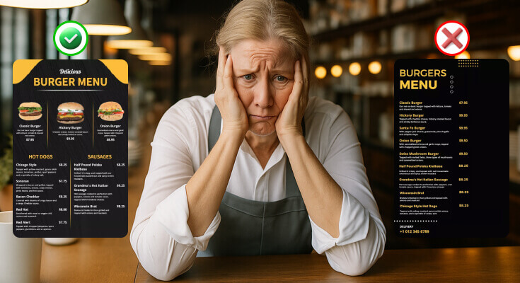
8. Poor Photography and Image Usage
Using food images on a menu can be powerful, and high-quality food photography can enhance your menu, but only if done correctly. Unfortunately, many restaurants make the mistake of including poor-quality photos or using too many images, which can damage the overall look and feel of the menu.
In some cases, it can even lower a customer’s trust in the restaurant. While poor images can damage your restaurant’s reputation.
Photography mistakes:
- Using low-resolution or poorly lit images
- Including too many photos that overwhelm the design
- Using stock photos that don’t represent your actual food
- Inconsistent photography styles throughout the menu
- Placing images randomly without design consideration
Best practices for menu photography:
- Use professional-quality images sparingly
- Ensure photos accurately represent your dishes
- Maintain consistent lighting and style
- Only photograph your most popular or signature items
- Consider your restaurant’s overall aesthetic
9. Neglecting Mobile and Digital Considerations
Many customers now expect to view menus on their smartphones—whether through QR codes at the table, your website, or a Google listing. If your menu isn’t mobile-friendly, you risk losing impatient customers before they even order. With the rise of QR code menus for restaurants and online ordering, many restaurants still design only for print. However, digital-first design has become essential for modern restaurants.
Digital menu requirements:
- Mobile-responsive design for smartphones
- Fast loading times for online menus
- Easy navigation on touch screens
- Readable text on small screens
- Accessible design for users with disabilities
QR code menu best practices:
- Provide physical menus as backup options
- Ensure QR codes are large enough to scan easily
- Test functionality across different devices
- Include clear instructions for accessing digital menus
- Maintain consistent branding between digital and print versions
10. Inconsistent Branding and Design Elements
Your menu should reflect your restaurant’s brand identity consistently. Nevertheless, many establishments create menus that feel disconnected from their overall brand experience. However, inconsistent branding is a common but costly menu design mistake.
There are many elements you should include in menu design to shine your restaurant’s identity. If any elements like fonts, colors, layout, or tone don’t match your brand, it creates confusion and weakens your image in the customer’s mind.
Branding elements to consider:
- Logo placement and sizing
- Color scheme matching your interior
- Font choices that reflect your cuisine style
- Overall design aesthetic (modern, rustic, elegant, etc.)
- Tone of voice in descriptions and copy
Common branding mistakes:
- Using generic templates that don’t reflect your personality
- Inconsistent use of brand colors and fonts
- Poorly integrated or oversized logos
- Mismatched design style with restaurant atmosphere
- Failing to update branding across all materials
What are the Mistakes to Avoid While Designing Digital Menu Boards?
1. Overloading the Screen with Too Much Information
One of the most common mistakes is trying to fit too many items, images, and text on the screen. Unlike printed menus, digital boards are meant to be viewed from a distance and often for just a few seconds. Therefore, the solution is to keep it simple. Focus on key menu items, categories, and bestsellers. Use multiple rotating screens if you need to show more content, but keep each screen clean and readable. If you want to know more about which menu format, printed or digital menu style, works for your restaurant, reading this guide might be helpful to you.
2. Poor Font Choices and Tiny Text
Fonts that are too small, too thin, or too decorative are hard to read on screens, especially from across the counter.
Use large, bold, sans-serif fonts (like Arial or Open Sans) that are easy to read. Keep font sizes between 30–60 pt, depending on screen size and distance.
3. Low Contrast Between Text and Background
Using light-colored text on a light background (or dark on dark) makes your menu nearly impossible to read. Make sure your text color stands out against the background. Example: white text on a dark background, or black text on a light background.
4. Fast or Distracting Animations
Digital screens allow movement, but too much animation or constant flashing can distract, annoy, or confuse customers. Use smooth, slow transitions or subtle animations only. Avoid constant blinking, scrolling text, or auto-looping effects that refresh too quickly.
5. Showing All Items at Once Without Focus
When everything is displayed at the same time, no item stands out. Customers don’t know what to choose or may overlook high-margin items. Highlight featured items, combos, or seasonal specials with larger text or visuals. Use color blocks or frames to draw attention to them.
6. Ignoring Screen Placement and Viewing Angles
Even the best design won’t work if the screen is placed too high, too far, or at a bad angle. Why it’s a problem: Customers might strain to read the board, especially in crowded or poorly lit areas. Place screens at eye level or just above. Make sure they’re visible from where customers typically stand while ordering.
Digital menu boards are a great way to modernize your restaurant and improve the ordering experience—but only when designed with care. By avoiding these common mistakes and focusing on clarity, simplicity, and branding, you’ll create a digital menu that attracts attention, speeds up decisions, and boosts sales.
What are the Budget-Friendly Menu Design Solutions?
After knowing all the mistakes and their fixes, here are some ultimate solutions to make a restaurant menu, even if you don’t have design skills and experience.
DIY Menu Design Tips
Small restaurants can create professional-looking menus without expensive designers. However, following design principles remains crucial for success.
Cost-effective design strategies:
- Use a free menu design tool that provides an easy-to-use interface and editing tools
- Choose simple, clean layouts over complex designs
- Focus on typography and hierarchy over fancy graphics
- Utilize high-quality free fonts and templates
- Invest in good copywriting over expensive visuals
When to Hire Professional Designers?
Sometimes professional help becomes necessary for optimal results. Therefore, consider these factors when making the decision.
Signs you need professional help:
- Consistently poor sales performance
- Customer complaints about menu confusion
- Outdated design that doesn’t match your brand
- Expansion requiring multiple location consistency
- Complex technical requirements for digital menus
Seasonal Menu Updates and Maintenance
Keeping your menu fresh and current maintains customer interest. Moreover, seasonal updates can boost sales and reduce food costs.
Update strategies:
- Seasonal ingredient availability and pricing
- Holiday and special event promotions
- Customer feedback implementation
- New trend adoption and menu evolution
- Underperforming item replacement
Maintaining Consistency Across Updates
While updating your menu, maintain core design elements that customers recognize. Similarly, preserve your brand identity through changes.
Consistency factors:
- Brand colors and typography
- Overall layout and organization
- Core menu items and signatures
- Pricing strategy and presentation
- Quality standards and descriptions
What are the Best Tips to Consider Before Designing a Restaurant Menu?
Before crafting your first menu, there are some menu design psychologies and considerations you need to understand, as they can greatly influence what customers order, how much they spend, and how they perceive your restaurant’s value and quality.
1. Know Your Brand and Theme
Your menu should reflect the personality of your restaurant. Whether it’s a fine dining space, a casual café, or a trendy food truck, the fonts, colors, layout, and language should match your restaurant’s style.
Tip: Stick to your brand’s color palette, tone, and design elements throughout the menu.
2. Understand Your Target Audience
Design with your customers in mind. What are their tastes, preferences, and dietary needs? A family restaurant menu will look very different from a vegan café or a corporate lunch spot.
Tip: Include relevant options like kids’ meals, vegan dishes, or quick lunches based on your audience.
3. Keep the Menu Focused
Too many items can overwhelm customers and hurt kitchen efficiency. A clear, well-structured menu with a focused selection performs better than a long, confusing one.
Tip: Use the “Golden Triangle” rule—customers naturally look at the top right, top center, and top left first. Place your high-margin or best-selling dishes in those areas.
4. Write Clear and Tempting Descriptions
Descriptions should be short, simple, and appetizing. Don’t use overly technical or generic words. Instead, highlight flavors, key ingredients, and cooking style.
Example:
- Bad: Grilled Chicken – $15
- Better: Grilled Chicken – Marinated overnight in herbs, flame-grilled to perfection – 15
5. Highlight High-Profit Items
Use visual tools like borders, icons, or shading to subtly draw attention to dishes with higher margins or popularity.
Tip: Don’t overdo it. Highlight 2 to 4 items per section at most.
6. Prepare for Print and Digital
Ensure your menu looks good both in print and on mobile devices. Many customers now browse menus online or via QR codes.
Tip: Use a mobile-responsive design or tools that optimize for both print and digital use.
7. Use High-Quality Visuals (If Needed)
If you include photos, make sure they’re professionally shot and represent your actual food. Avoid using too many images, as this can clutter the design.
Tip: Use images only for a few key dishes to increase appetite appeal.
8. Review and Update Regularly
Your menu shouldn’t stay the same forever. As seasons, trends, and costs change, update your dishes and design to stay fresh and relevant.
Tip: Revisit your menu every 6–12 months to remove low performers and refresh design elements.
Frequently Asked Questions
1. Why is having too many items on a menu a mistake?
A menu with too many options can overwhelm customers and lead to decision fatigue. It also reduces kitchen efficiency and makes it harder to maintain consistent food quality.
2. Why should I avoid placing prices in a single column?
Lining up prices encourages customers to compare dishes based on cost rather than value or taste. It often leads them to choose the cheapest items rather than your best offerings.
3. What’s the biggest mistake in writing food descriptions?
Using boring, generic words like “delicious” or “tasty” doesn’t help sell your food. Instead, describe the cooking method, ingredients, and flavors. For example, write “pan-seared salmon with lemon butter sauce” instead of “delicious fish dinner.”
4. How can I tell if my menu design is working?
Track your sales data to see which items sell well and which don’t. Monitor how long customers take to order and ask for feedback directly. Additionally, watch for signs like customers asking many questions about the menu or seeming confused when ordering.
5. Can a bad layout and structure hurt my sales?
Yes. A disorganized menu makes it harder for customers to navigate and find what they want. A clear layout with grouped sections helps improve the ordering experience.
Conclusion
These are the top mistakes to avoid when designing a restaurant menu, and avoiding them can significantly improve your customer experience and business profitability. Remember that effective menu design combines psychology, marketing, and practical considerations to create a tool that serves both your customers and your business goals.
Start by auditing your current restaurant menu against these guidelines. Then, prioritize the most critical issues affecting your customer experience and sales performance. With careful planning and attention to detail, your menu can become a powerful driver of restaurant success.