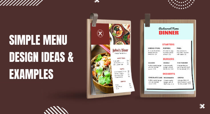
Creating an effective menu design can make or break your restaurant’s profitability. Furthermore, simple menu design ideas often outperform complex layouts because they guide customers toward quick decisions. In fact, studies show that well-designed menus can increase sales by up to 20%. Therefore, understanding the principles of simple menu design becomes crucial for any restaurant owner looking to boost revenue.
Moreover, today’s customers appreciate clean, easy-to-read menus that don’t overwhelm them with choices. Additionally, simple menu designs work better across different platforms, from print to digital displays. Consequently, investing time in creating effective menu design ideas will pay dividends in customer satisfaction and increased sales.
What is the Importance of Simple Menu Designs?
A simple menu design plays a big role in creating a great dining experience. When the menu is clean, easy to read, and well-organized, customers feel more comfortable and confident while choosing their food. A cluttered or confusing menu can overwhelm people, slow down decision-making, and even affect their overall impression of the restaurant. On the other hand, a simple design helps customers quickly find what they want without feeling stressed.
Here’s why a simple menu matters:
- Easy to read – Clear fonts, proper spacing, and neat sections make it easier for people of all ages to read the menu.
- Faster choices – With fewer items and well-organized categories, customers can decide quickly, which also speeds up service.
- Highlights key dishes – Simple menus allow you to focus attention on your signature or most profitable items.
- Builds a professional image – A neat and tidy menu shows that your restaurant is thoughtful, modern, and customer-focused.
- Reduces printing and design costs – Fewer items and pages mean it’s cheaper and easier to update or print the menu when needed.
What are the Popular Simple Menu Design Examples and Ideas?
Simple menu design is all about keeping things clean, easy to read, and customer-friendly. The goal is to present your food and drinks in a way that makes it easy for people to decide what to order, while still reflecting your restaurant’s brand and style.
Below are some of the most popular simple menu design ideas, along with examples that show how each one works well in different types of restaurants or cafés.
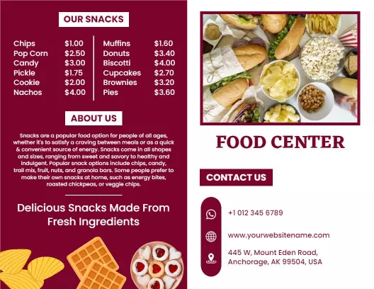
1. Minimalist One-Page Menu Design
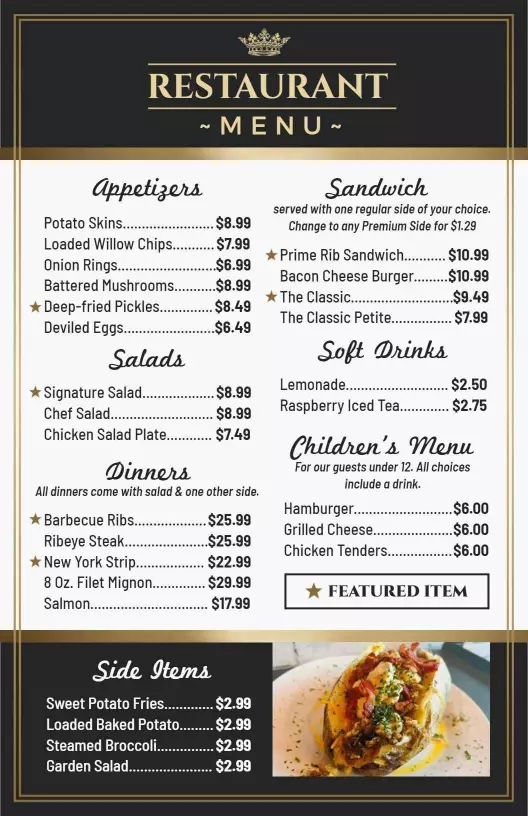
A one-page menu design is one of the simplest and most effective ways to present your food and drink options. It includes all categories—like starters, main dishes, desserts, and beverages—on a single sheet. This layout is perfect for small or mid-sized restaurants with a focused selection of items.
Moreover, one-page menu design makes scanning easier for customers. They can quickly read through categories without their eyes jumping around the page. Furthermore, this design adapts beautifully to mobile devices and online ordering platforms.
Consider implementing these elements in your single-column design:
- Clear section headers with ample white space
- Consistent item formatting throughout
- Strategic use of lines or subtle backgrounds to separate sections
- Prominent placement of signature dishes
2. Grid-Based Menu Layouts
Grid-based designs offer another excellent approach to simple menu design ideas. First, this layout organizes items into neat columns and rows, creating a clean, organized appearance. Additionally, grids work exceptionally well for restaurants with extensive beverage menus or multiple food categories.
Furthermore, grid layouts allow you to showcase images effectively without overwhelming the design. You can feature photos of signature dishes while maintaining the overall simplicity. Moreover, this format translates perfectly to digital menu boards and tablet menus.
Key advantages of grid-based layouts include:
- Professional, modern appearance
- Easy visual scanning for customers
- Balanced distribution of menu items
- Flexible accommodation of different content types
3. Category-Focused Design Approach
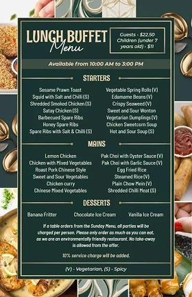
Category-focused designs represent another powerful strategy in simple menu design ideas. First, this approach dedicates specific sections or pages to different menu categories. Additionally, it helps customers navigate large menus more efficiently.
Moreover, category-focused designs allow you to highlight seasonal specials or chef recommendations within each section. Furthermore, this layout works particularly well for family restaurants and establishments with diverse offerings.
Consider organizing your menu into these logical categories:
- Appetizers and small plates
- Soups and salads
- Main courses (subdivided by protein type)
- Desserts and beverages
- Daily specials or seasonal items
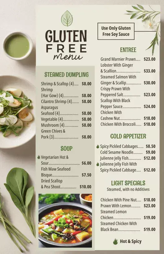
4. Menu with Icons or Small Illustrations
Using icons or small illustrations in your menu is a smart way to make it simple, clear, and more user-friendly. These small symbols—like a chili for spicy food, a leaf for vegetarian dishes, or a gluten-free icon—help customers quickly understand what each item is about, without reading long descriptions. They also make the menu look more attractive and organized.
For example, a small star next to a chef’s special or a heart beside a popular dish draws attention cleanly and subtly. These icons should be simple, easy to recognize, and used consistently throughout the menu.
Here’s why icons are useful in simple menu design:
- Quick to understand – Customers can spot suitable dishes at a glance.
- Saves space – Icons take up less room than long descriptions.
- Adds style – Simple illustrations make your menu more visually appealing.
- Improves accessibility – Helps non-native speakers or people with reading difficulties.
Used the right way, icons make your menu both functional and attractive, enhancing the overall dining experience.
5. Folded Menu or Bifold Layout
A folded menu, also called a bifold menu, is a simple and practical design that opens like a small booklet. It usually has a front cover and two inside pages, giving you more space to list items without making the menu look crowded. This design is perfect for restaurants that offer a wider variety of dishes but still want to keep things clean and organized.
The bifold layout allows you to separate sections clearly, such as placing food items on one side and drinks or desserts on the other. It’s also easy for customers to hold and flip through, making the ordering process smooth and enjoyable.
Here’s why bifold menus work well:
- Organized layout – Helps divide the menu into clear sections.
- Easy to handle – Comfortable to open and browse through.
- More space – Lets you include more items without overcrowding.
- Professional look – Gives a neat and polished appearance.
6. QR Code Menus with Clean Mobile Layout

QR code menu designs have become very popular in restaurants, especially because they are contactless, easy to access, and simple to update. When scanned using a smartphone, the QR code opens a digital version of your menu. For a better customer experience, this digital menu should have a clean, mobile-friendly layout.
It should be easy to scroll, with large text, clear categories, and quick loading speed. A simple layout makes it easy for customers to browse and order without zooming in or getting lost.
Here’s why clean mobile layouts are important for QR code menus:
- Easy to navigate – Customers can quickly find what they need.
- Fits all screens – Works well on all phone sizes.
- Quick to load – Prevents frustration from slow or cluttered pages.
- No printing needed – Saves time and money on updates.
These are the best simple menu design examples, and if you are looking for customizable menu templates that you can easily edit, share, and print for your restaurant, you can explore our template library and get some inspiration.
What are the Core Principles of Effective Simple Menu Design?
Designing a simple menu doesn’t mean removing important items or being plain. It means creating a clean, well-organized, and customer-friendly layout that improves the dining experience and boosts your business.
Below are the core principles of effective simple menu design, explained in-depth and in simple language:
1. Visual Hierarchy and Layout Structure
Creating a strong visual hierarchy forms the foundation of successful simple menu design ideas. First, establish clear sections using strategic white space and typography. Additionally, use different font sizes to guide the reader’s eye naturally through your menu.
Moreover, the golden triangle principle applies perfectly to menu design. Customers typically look at the center first, then the top right, and finally the top left. Therefore, place your most profitable items in these prime locations.
Furthermore, limit your menu to one or two pages whenever possible. Research shows that customers prefer shorter menus because they reduce decision-making time. Consequently, focus on your best dishes rather than overwhelming customers with endless options.
2. Typography and Readability
Typography plays a crucial role in restaurant menu design ideas. First, choose fonts that reflect your restaurant’s personality while maintaining excellent readability. Additionally, use no more than three different fonts throughout your entire menu design.
Moreover, ensure sufficient contrast between text and background colors. Dark text on light backgrounds works best for most situations. Furthermore, maintain consistent font sizes for similar menu elements to create a cohesive look.
Consider these typography guidelines:
- Headlines should be 18-24 points
- Item names should be 12-14 points
- Descriptions should be 10-12 points
- Prices should match item name sizes
3. Color Psychology in Menu Design
Color choices significantly impact customer behavior in simple menu design ideas. First, warm colors like red and orange can stimulate appetite and create urgency. Additionally, green suggests freshness and health, making it perfect for salads and vegetarian options.
Furthermore, avoid using too many colors in your design. Stick to a maximum of three main colors plus black and white. Moreover, ensure your color choices align with your brand identity and restaurant atmosphere.
Additionally, consider how colors will appear under your restaurant’s lighting. What looks great in bright daylight might appear different under warm dining room lights.
Here we’ve covered a detailed guide on best color combinations and fonts to use in menu design to make it stand out and appetizing.
4. Limit the Number of Items
Having too many choices can overwhelm people. It may also lower the chance of them ordering your best dishes. Keeping the number of items limited makes the menu look cleaner and more effective.
Tips to follow:
- Include only the most popular and high-performing dishes.
- Aim for 6–8 items per category at most.
- Remove low-selling or duplicate items.
Why it matters: Less is more. A shorter menu helps customers make faster decisions and also improves kitchen efficiency.
5. Use of White Space
White space, also known as negative space, is the empty area around text, images, or design elements on a menu. While it may seem like wasted space, it’s actually one of the most powerful tools in simple menu design. White space helps reduce visual clutter, making the menu look clean, calm, and easy to read. It gives each menu item room to stand out, allowing customers to focus on one section at a time without feeling overwhelmed.
- Don’t overcrowd items or squeeze too much text into one area.
- Use margins and spacing between items and sections.
- Avoid background patterns that make text hard to read.
Good use of white space makes the menu look modern, calming, and professional. It improves overall readability.
6. Strategic Placement of High-Profit Items
Placing your high-profit items in the right spots on the menu is a smart way to increase sales without saying a word. In simple menu design, layout plays a key role in guiding the customer’s eyes. Studies show that people tend to look at certain areas of a menu first—like the top-right corner or the center of a page. These are known as “prime spots,” and placing your most profitable dishes there can lead to more orders of those items.
- Position high-margin dishes in the top-right or center areas of the menu.
- Use borders or highlights to separate them gently from the rest.
- Avoid overwhelming the customer with too many “special” tags—focus on a few key items.
This thoughtful placement not only helps boost revenue but also supports a clean and purposeful menu design.
7. Keep It Updated
Keeping your menu updated is an important part of simple and effective menu design. An outdated menu can confuse customers, create ordering issues, or even damage your restaurant’s reputation. For example, if a customer orders something that’s no longer available, it can lead to disappointment and slow down service.
Updating your restaurant menu regularly ensures that it reflects your current dishes, seasonal ingredients, pricing, and customer preferences. It also gives you a chance to remove low-selling items and highlight new or trending ones.
Here are a few simple tips for keeping your menu updated:
- Review your menu every few months to check which items are selling well.
- Remove dishes that are no longer available or popular.
- Adjust prices based on ingredient costs and market changes.
- Keep your printed and digital menus (website or QR code) consistent.
What are Considerations to Make Simple Menu Design Stand Out?
1. Font Selection Best Practices
Choosing the right fonts is essential for successful simple menu design ideas. First, select fonts that match your restaurant’s personality and target audience. Additionally, ensure your chosen fonts remain legible across different sizes and printing conditions.
Moreover, avoid decorative fonts for body text, as they can reduce readability. Instead, use clean, simple fonts, and also write good menu descriptions. Furthermore, reserve stylized fonts only for headers or restaurant names.
Professional font combinations include:
- Serif headers with sans-serif body text
- Bold sans-serif headers with lighter body text
- Script restaurant names with clean menu text
- Modern fonts for contemporary establishments
2. Menu Psychology and Colors
Understanding menu design psychology and color scheme elevates simple menu design ideas to new levels. First, different colors trigger specific emotional responses that can influence ordering decisions. Additionally, strategic color use can highlight profitable items or create desired atmospheres.
Moreover, warm colors tend to stimulate appetite and encourage quick decisions. Red, orange, and yellow work particularly well for casual dining establishments. Furthermore, cooler colors like blue and green suggest freshness and healthy options.
Consider these color associations:
- Red: Creates urgency and stimulates appetite
- Orange: Suggests warmth and comfort food
- Yellow: Implies happiness and casual dining
- Green: Indicates freshness and healthy choices
- Blue: Conveys trust and professionalism
- Purple: Suggests luxury and sophistication
3. Layout and Spacing Techniques
Effective use of white space distinguishes professional simple menu design ideas from amateur attempts. First, white space gives your menu a clean, uncluttered appearance that customers appreciate. Additionally, proper spacing helps guide the reader’s eye through your content naturally.
Moreover, white space around important items draws attention without using flashy graphics or colors. This technique works particularly well for highlighting signature dishes or daily specials. Furthermore, adequate spacing between sections helps customers process information more easily.
Strategic white space applications include:
- Margins around the entire menu
- Space between different menu sections
- Padding around individual menu items
- Breathing room around prices and descriptions
4. Section Organization
Logical section organization forms the backbone of successful simple menu design ideas. First, arrange menu sections in the order customers typically order: appetizers, mains, desserts, beverages. Additionally, place your most popular or profitable items in prominent positions within each section.
Moreover, follow the best practices to organize a restaurant menu and create visual harmony. This consistency helps customers navigate your menu more efficiently. Furthermore, consider using subtle visual elements like lines or background colors to separate sections clearly.
Effective section organization includes:
- Logical flow from light to heavy dishes
- Clear section headers with consistent styling
- Appropriate spacing between different categories
- Strategic placement of high-margin items
5. Digital vs. Print Menu Considerations
Digital menus require special considerations within simple menu design ideas. First, ensure your design works well on various screen sizes, from smartphones to large displays. Additionally, consider how customers will interact with digital menus differently than printed versions.
Moreover, digital menus offer opportunities for dynamic content like daily specials or real-time availability updates. Furthermore, they can include interactive elements while maintaining overall simplicity. However, avoid overwhelming customers with too many digital features.
Digital menu best practices:
- Responsive design for all device sizes
- Fast-loading images and content
- Simple navigation between sections
- Clear call-to-action buttons for ordering
- Accessibility features for all users
If you aren’t sure about which digital or printed menu format works best for your restaurant, checking this guide might help you.
Print Menu Design Essentials
Print menus still play a vital role in many simple menu design ideas. First, ensure your design reproduces well in print, considering paper quality and printing limitations. Additionally, design for durability since print menus face daily wear and tear.
Moreover, print menus should work under various lighting conditions in your restaurant. Test your design under both bright and dim lighting to ensure readability. Furthermore, consider the physical handling of your menu when choosing paper stock and folding options.
Print-specific considerations include:
- High-resolution images that print clearly
- Color accuracy across different printing methods
- Durable paper stock appropriate for restaurant use
- Proper file formats for professional printing
- Coating options for easy cleaning
If you want an effective solution for menu creation, head on to the online menu creator tool that helps you find pre-designed menu templates, allows you to customize, and download instantly. Also, it streamlines the menu design process, and
How to Test and Optimize Your Simple Menu Design?
Customer Feedback Integration
Gathering customer feedback is essential for refining simple menu design ideas. First, observe how customers interact with your current menu to identify problem areas. Additionally, directly ask customers about their menu experience during their visit.
Moreover, pay attention to server feedback about common customer questions or confusion points. Furthermore, track which items customers order most frequently and adjust your design to promote profitable dishes.
Effective feedback collection methods:
- Informal customer conversations during service
- Brief surveys with receipt or online ordering
- Server observations and recommendations
- Social media comments and reviews
- Mystery shopper evaluations
A/B Testing Menu Layouts
A/B testing provides valuable data for optimizing simple menu design ideas. First, create two versions of your menu with different layouts or item placements. Additionally, track sales data to determine which design performs better.
Moreover, test one element at a time to isolate what changes affect customer behavior. Furthermore, run tests long enough to gather statistically significant data before making permanent changes.
A/B testing opportunities include:
- Different item placement strategies
- Various color schemes or typography choices
- Alternative section organization methods
- Different pricing display formats
- Various description lengths and styles
Seasonal and Special Event Menu Adaptations
Flexible Design Systems
Creating flexible design systems enhances simple menu design ideas for seasonal changes. First, develop samples that allow easy updates for seasonal ingredients or holiday specials. Additionally, maintain consistent branding while adapting content for different occasions.
Moreover, flexible systems reduce costs and time required for menu updates. Furthermore, they ensure brand consistency across all seasonal variations and special promotions.
Design flexibility strategies:
- Modular layouts that accommodate different content lengths
- Color schemes that work with seasonal themes
- Typography systems that scale for various uses
- Template designs for recurring seasonal items
- Quick-change systems for daily specials
Holiday and Special Event Menus
Special occasion menus require careful consideration within simple menu design ideas. First, maintain your restaurant’s core design identity while incorporating appropriate seasonal elements. Additionally, ensure special menus work well alongside your regular offerings.
Moreover, seasonal menu planning provides opportunities to highlight premium items and increase average order values. Furthermore, they create excitement and give customers reasons to return for different experiences.
Special event menu considerations:
- Limited-time offer presentations
- Premium item highlighting techniques
- Seasonal color and imagery integration
- Clear differentiation from regular menu items
- Easy integration with existing design systems
Frequently Asked Questions
1. What is a simple menu design?
A simple menu design is a clean, clear, and easy-to-read layout that helps customers quickly understand their options without feeling overwhelmed. It focuses on organizing food and drink items in a logical way, using readable fonts, minimal colors, and enough white space to make the menu feel open and uncluttered. In short, a simple menu design combines function and style to create a better overall dining experience.
2. How many items should I include in a simple menu?
In a simple menu, it’s best to include only the most popular, high-quality, and well-prepared items. A good rule of thumb is to offer around 6 to 8 items per category, such as appetizers, mains, desserts, and drinks. This keeps the menu focused and prevents customers from feeling overwhelmed by too many choices. A smaller selection also helps your kitchen staff work more efficiently and maintain consistent food quality.
3. What fonts are best for simple menu designs?
For a simple menu design, the best fonts are clean, modern, and easy to read. Sans-serif fonts like Arial, Helvetica, Roboto, Open Sans, or Lato are great choices because they look neat and work well in both print and digital formats. These fonts make the menu appear organized and professional without distracting from the content. It’s important to use consistent font sizes—larger for section headings and slightly smaller for item names and descriptions.
4. How can icons improve my menu design?
Icons can greatly improve your menu design by making it easier for customers to quickly understand and navigate your offerings. Small, simple symbols—such as a leaf for vegetarian dishes, a chili for spicy items, or a peanut icon for allergy warnings—help people identify what suits their preferences or dietary needs at a glance. This not only saves time but also makes the menu more visually appealing without adding too much text or clutter. Icons guide the customer’s eyes and highlight key details, making the overall design more user-friendly.
5. How do QR code menus fit into simple design?
QR code menus are a perfect match for simple design because they offer a clean, contactless, and easy-to-update way to present your menu. When scanned with a smartphone, the QR code opens a digital menu that should be mobile-friendly, fast-loading, and easy to read. A simple digital layout—using one-column formats, large fonts, clear categories, and minimal colors—makes it effortless for customers to browse and choose their meals. QR code menus also reduce clutter on tables and eliminate the need for printing multiple copies.
6. How often should I update a simple menu?
A simple menu should be updated regularly to keep it fresh, accurate, and aligned with customer preferences. Ideally, you should review and update your menu every 3 to 6 months, or seasonally, depending on your ingredients, trends, and business goals. Updating your menu allows you to remove items that are not selling well, adjust prices based on food costs, and introduce new or seasonal dishes. Regular updates also show customers that your restaurant is active, modern, and focused on quality.
Conclusion
Following these simple menu design examples and ideas can improve your restaurant’s customer experience and boost sales. By focusing on clarity, clean layouts, and user-friendly elements like one-page formats, icons, QR codes, and minimalist designs, you make it easier for guests to browse and order with confidence. A well-designed simple menu also helps highlight your best dishes, supports faster service, and reflects your brand’s style professionally.
To take action, start by reviewing your current menu—remove clutter, reduce item count, choose clean fonts, and organize sections. Consider introducing icons for dietary preferences, using a one-page or bifold layout, and making your digital menus mobile-friendly. Most importantly, keep your menu updated regularly to match changing customer needs and food costs.