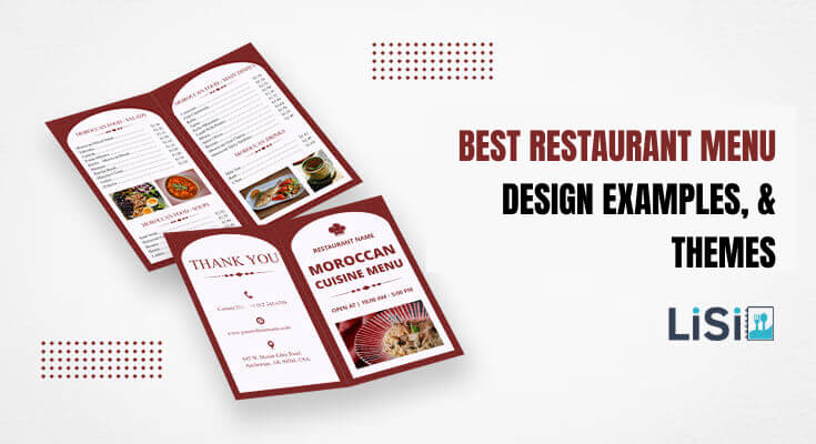
Explore the world of restaurant menu design examples through inspiring themes and creative ideas that transform dining experiences. This comprehensive collection showcases diverse menu design approaches, from minimalist concepts to bold artistic expressions, helping restaurant owners discover the perfect style for their establishment.
In this comprehensive guide, we’ll explore the best restaurant menu design examples, themes, and provide actionable insights to help you create menus that convert browsers into buyers.
What Makes Restaurant Menu Designs Stand Out?
Modern restaurant menu designs are not just about listing dishes. They’re powerful tools that shape a customer’s first impression, influence their choices, and even boost sales. In today’s competitive dining scene, a well-designed menu does more than look attractive.
1. Clean and Minimalist Layouts
Modern menus avoid clutter. Instead of cramming too many items or images on one page, they use white space wisely. This makes the menu easy to scan and less overwhelming. A clean layout allows customers to focus on what really matters: the food. It also gives a premium feel, especially in upscale restaurants.
Why it matters: Studies show customers spend an average of 109 seconds looking at a menu. A clean design helps them make faster, better decisions.
2. High-Quality Visuals
Modern menus often include professional food photography or illustrations. A mouthwatering image can tempt customers to try something new or go for a higher-priced item. But not every item needs a photo — using a few powerful visuals can increase appetite appeal without looking cheap.
Pro tip: Images should match the real food. Misleading photos hurt trust and lead to disappointment.
3. Readable Fonts and Font Sizes
Fancy fonts may look stylish but can be hard to read. Modern menu design focuses on simple, readable typography. The text size is also important — customers should never struggle to read your menu, whether it’s a printed or digital menu style.
Best practices include:
- Using two or three font types at most
- Choosing bold headers for categories
- Avoiding cursive fonts for body text
4. Smart Use of Colors
Color isn’t just about decoration. In modern menu design, color psychology plays a key role. For example:
- Red and yellow can trigger appetite.
- Green signals freshness and health.
- Black and gold suggest elegance and luxury.
Menus that follow a color scheme that matches the restaurant’s interior and brand identity create a seamless experience for the customer.
5. Strategic Menu Engineering
Modern menu design uses menu psychology and engineering to subtly influence what customers order. This includes:
- Placing high-profit items in the “Golden Triangle” — the top right, top center, and top left sections.
- Using descriptive labels like “Chef’s Special” or “Most Popular.”
- Highlighting signature dishes with boxes, icons, or bold fonts.
These techniques guide customers toward items you want to sell more of — without being too obvious.
6. Digital and Interactive Menus
In today’s tech-driven world, QR code menus for restaurants, touchscreen ordering, and even interactive tablet menus are becoming the norm. These digital options are not only safe and cost-effective, but they also:
- Allow for easy updates
- Add animation or video previews
- Support multi-language options
Restaurants that adopt digital menus stand out for their modern, customer-friendly approach.
If you aren’t sure about what elements should include in menu design to make it stand out, we’ve covered a details guide that you must check out.
How Do Different Cuisine Types Influence Restaurant Menu Design?
The type of cuisine a restaurant serves greatly affects how the menu looks, feels, and communicates with customers.
Below is an in-depth look at how different cuisine types influence menu design, along with real-world examples and ideas:
1. Italian Restaurant Menu Examples
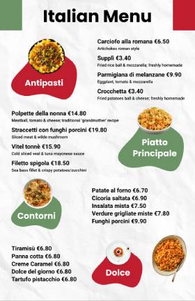
Design Style: Warm, rustic, elegant
Common Elements:
- Earthy tones like red, green, and beige
- Handwritten or script-style fonts
- Textured backgrounds like wood grain or parchment
Italian cuisine is all about comfort, tradition, and passion. Menus often feature pasta, pizza, wine, and desserts. An Italian menu might include romantic language like “Antipasti,” “Secondi,” or “Dolci.” Descriptive wording is essential to make dishes sound delicious and authentic.
Concept: A trattoria-style menu with two columns — one for traditional Italian dishes and one for chef specials. Add wine pairings under each main dish for a fine-dining feel.
2. Asian Fusion Menu Design Ideas
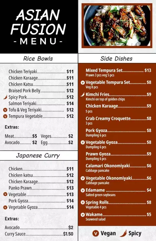
Design Style: Sleek, modern, culturally rich
Common Elements:
- Contrasting colors like red and black or gold and white
- Asian-inspired illustrations (bamboo, waves, chopsticks)
- A mix of traditional and modern fonts
Asian fusion menus often blend Japanese, Chinese, Thai, and Korean elements. The design needs to reflect this cultural mix while remaining easy to understand. Using icon-based labels (spicy, vegetarian, gluten-free) helps customers with diverse preferences.
Concept: A modern one-page menu with sectioned blocks for Sushi, Stir-fry, Noodles, and Street Food. Each block could have a minimal icon and short description for clarity.
3. American Bistro Menu Concepts
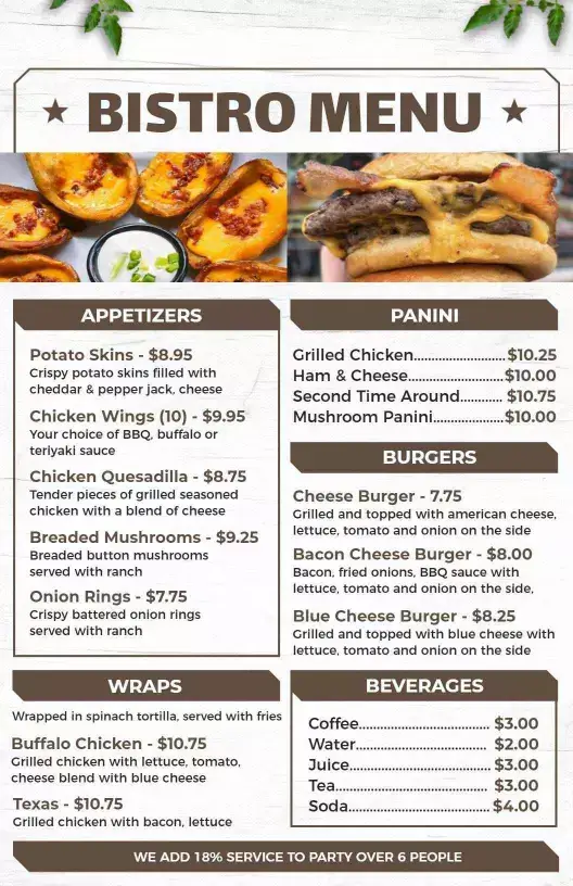
Design Style: Bold, clean, and inviting
Common Elements:
- Straightforward fonts (like serif or sans serif)
- Strong sections like Burgers, Sandwiches, Salads, and Mains
- Use of high-quality food images and blackboard textures
American bistros serve comfort food with a modern twist. Menus often have seasonal or rotating items, so flexibility is key. American menus focus on portion sizes and customization, which should be clearly stated.
Concept: A two-sided menu — one for lunch and one for dinner. Include “Build Your Own Burger” or “Chef’s Pick” to highlight customer choice and specials.
4. Mexican Taqueria or Cantina Menu Styles
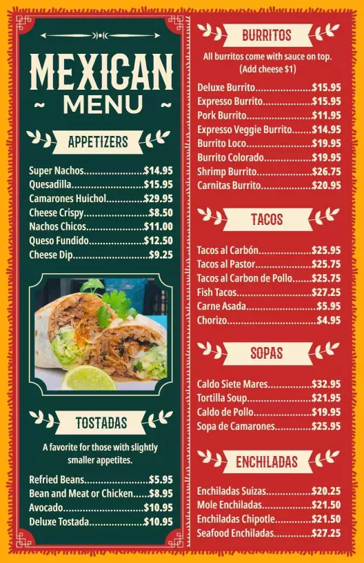
Design Style: Colorful, festive, and vibrant
Common Elements:
- Bright colors like orange, turquoise, and yellow
- Fun typography with Mexican motifs
- Decorative borders or patterns
Mexican menus are fun, flavorful, and full of variety — think tacos, enchiladas, margaritas, and street snacks. A Mexican menu should feel energetic and playful, matching the casual, community vibe.
Concept: A fold-out menu with sections for Tacos, Bowls, Sides, and Drinks. Include small illustrations like peppers or sombreros to add personality. Here, check out more examples of Mexican menus.
5. French Menu Design
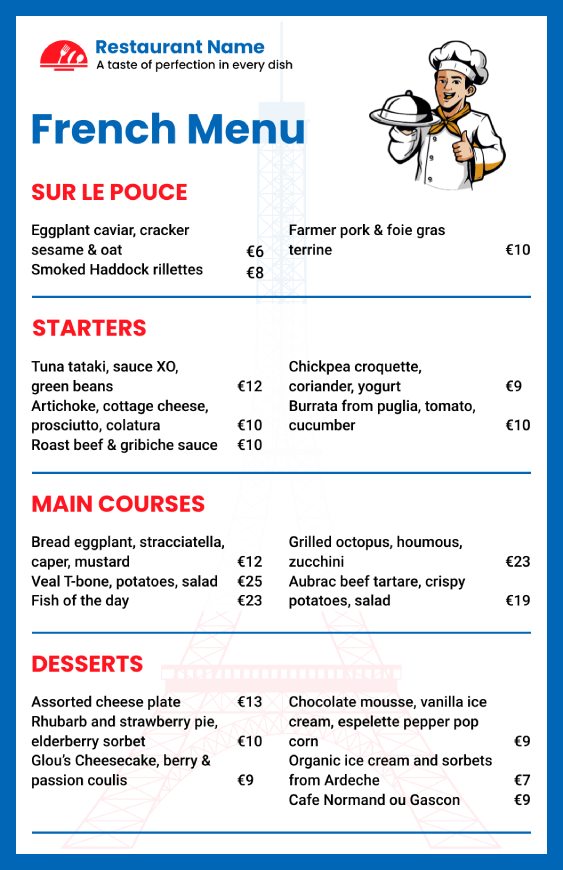
Design Style: Elegant, romantic, minimal
Common Elements:
- Creamy tones, navy blue, or soft pastels
- Serif fonts with French accents
- Use of French culinary terms
French menus are known for their refined structure, with sections like “Entrées,” “Plats,” and “Desserts.” Minimalism and white space are used to create a classy feel. Wine and cheese pairings are often prominently featured.
Concept: A narrow, vertical menu printed on high-quality textured paper. Highlight signature dishes like Coq au Vin or Crème Brûlée with delicate line art.
6. Indian Restaurant Menu Themes
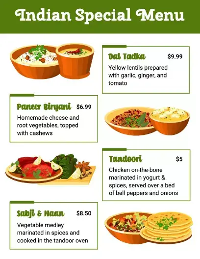
Design Style: Rich, traditional, vibrant
Common Elements:
- Deep colors like maroon, gold, and saffron
- Ornamental borders and patterns
- A mix of English and regional language names
Indian cuisine is diverse and deeply rooted in tradition. Menu designs reflect this with bold flavors and cultural symbolism. A good Indian menu needs clear categories — Veg, Non-Veg, Tandoori, Curries, Breads, and Sweets — with spice levels indicated.
Concept: A three-panel menu with detailed sections, dish names in both English and Hindi (or other regional languages), and spice icons to guide choices.
7. Vegan or Health-Focused Menus
Design Style: Fresh, clean, eco-friendly

Common Elements:
- Soft greens, white backgrounds, and plant-based icons
- Clear, health-oriented fonts
- Emphasis on sustainability, nutrition, and ingredients
These menus often list gluten-free, dairy-free, and organic options. They are designed to look natural and minimal, often with handwritten notes or ingredient sourcing details.
Concept: A one-page menu printed on recycled kraft paper with simple line art of vegetables and clean typography.
Tip: Explore our entire library of creative menu templates that you can find as inspiration to create restaurant menus in minutes.
What Are the Best Restaurant Menu Themes with Examples?
Different restaurant types require different design approaches. Let’s explore the most effective menu design themes that work across various dining establishments.
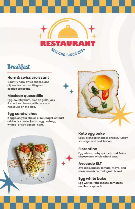
1. Simple and Minimalist Menu
Simple menu designs have gained popularity because they reduce visual clutter and help customers focus on what matters most—the food. These clean, simple layouts work particularly well for upscale casual dining and contemporary restaurants.
Characteristics of Minimalist Menus:
- Abundant white space
- Simple, clean fonts
- Limited color palette
- High-quality food photography
- Clear section divisions
When to Use Minimalist Design: Minimalist menus work best for restaurants with smaller, curated menus. Additionally, they’re ideal for establishments that want to convey sophistication and quality over quantity.
Real-World Examples:
Many successful restaurant chains have adopted minimalist approaches. For example, premium burger joints often use simple black text on white backgrounds with minimal graphics. Similarly, upscale cafes frequently employ clean layouts with subtle accent colors.
2. Vintage and Retro Menu Theme
Vintage menu designs create nostalgia and storytelling opportunities. These designs transport customers to different eras while building emotional connections with your brand.
Key Elements of Vintage Menus:
- Aged paper textures
- Classic typography (serif fonts)
- Muted, warm color palettes
- Hand-drawn illustrations
- Ornate borders and decorative elements
Industries That Benefit from Vintage Design:
- Classic American diners
- Barbecue restaurants
- Traditional steakhouses
- Family-owned establishments
- Pizza parlors with history
Implementation Tips:
When creating vintage menus, balance nostalgia with readability. Furthermore, ensure that decorative elements don’t overwhelm the menu items. Additionally, consider using subtle textures rather than heavily distressed backgrounds that might hinder legibility.
3. Elegant Fine Dining Menu Theme
Fine dining establishments require sophisticated menu designs that reflect their premium positioning. These menus must convey luxury while maintaining functionality.
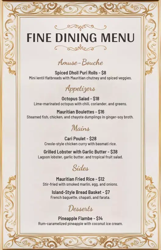
Hallmarks of Fine Dining Menus:
- Premium paper stocks
- Elegant typography
- Sophisticated color schemes
- Minimal but impactful design elements
- Clear course progressions
Design Considerations: Fine dining menus often feature multiple courses and wine pairings. Consequently, organization becomes crucial for customer navigation. Additionally, these menus frequently change seasonally, requiring flexible design systems.
Luxury Menu Features:
- Embossed or foil-stamped logos
- High-quality paper with unique textures
- Leather or fabric covers
- Custom illustrations or photography
- Multiple language options
If you are just starting your new restaurant, but aren’t sure about the concept of menu design, head on to free menu maker that will help you find a desired menu design, and allows you to create a perfect one for your restaurant without even design skills.
What are the Essential Elements of Effective Restaurant Menu Design?
Before diving into specific examples, let’s understand the fundamental components that make menus successful. These menu design principles form the foundation of every great restaurant menu.
1. Typography and Readability
Typography and readability play a major role in how customers interact with your restaurant menu. Simply put, if the text is hard to read, customers may struggle to choose what they want — or worse, give up altogether.
That’s why choosing the right fonts and making the content clear is so important. Good typography means using fonts that are clean, simple, and easy to understand.
Avoid overly decorative or cursive fonts that look stylish but are hard to read, especially in low lighting. Stick to professional, legible fonts like sans-serif or serif styles for the main text.
Also, make sure the font size is large enough for everyone to read comfortably — including older customers or those with visual difficulties. Use bold or larger fonts to highlight section headers like “Appetizers” or “Desserts” so people can easily scan through the menu. Keep enough space between lines and items to prevent the text from looking cramped.
Best Practices for Menu Typography:
- Use maximum 2-3 font families
- Ensure text size is at least 12 points
- Maintain high contrast between text and background
- Choose fonts that reflect your restaurant’s personality
- Avoid overly decorative fonts for body text
Here, learn about how typography and color combinations impact menu design with examples.
2. Logical Flow and Menu Structure
People tend to scan menus in a particular pattern — usually from the top to the middle, then to the bottom or corners. This pattern is often referred to as the “Golden Triangle.”
Place your most profitable dishes where the eye naturally goes:
- Top center
- Top right
- Top left
Also, follow a natural dining order:
- Starters or small plates
- Main courses
- Sides and extras
- Desserts and drinks
This structure helps customers move through the menu easily and encourages them to try more than one course.
3. Menu Categories and Item Descriptions
Good menus divide items into clear sections. Each category should be easy to find and should include just enough items to offer variety without overwhelming the reader.
Tips for descriptions:
- Use simple and appealing language
- Highlight ingredients, cooking methods, or unique flavors
- Keep descriptions short, around 2–3 lines
- Avoid overuse of buzzwords or complex culinary terms
For example: Instead of saying “Grilled Chicken Breast,” try:
“Herb-marinated grilled chicken breast served with roasted garlic mash and seasonal vegetables.”
This makes the dish more appealing and helps customers understand what they’re ordering.
4. Effective Use of Colors
Colors affect mood and behavior. In restaurant menus, color choice should match your brand and trigger the right emotions.
Color psychology examples:
- Red and yellow: Stimulate appetite (used by fast food chains)
- Green: Suggests freshness and health (great for vegan/organic menus)
- Black and gold: Reflect luxury and elegance
- Blue: Often avoided for food because it suppresses appetite, but can work for seafood or coastal themes
Use contrast between background and text for better readability. Too many colors can be distracting, so stick to a consistent palette.
5. Highlighting and Emphasizing Key Items
Highlighting key items on your menu helps guide customers toward the dishes you want to promote—such as your best-sellers, high-profit items, or chef’s specials. When done right, it makes certain meals stand out without overwhelming the rest of the menu. Simple design techniques like using boxes, bold fonts, colored backgrounds, or small icons (like a star or “chef’s choice” symbol) can draw attention to specific items.
This not only improves the customer’s decision-making process but can also increase sales of those highlighted dishes. However, it’s important not to overdo it—if too many items are emphasized, nothing will truly stand out. Smart highlighting makes your menu more attractive, easier to navigate, and more profitable for your business.
6. Branding and Theme Consistency
Branding and theme consistency mean that your menu should match the overall look and feel of your restaurant. Everything—from colors and fonts to images and language—should reflect your restaurant’s personality. For example, a modern café might use a clean, minimalist design with neutral colors and simple fonts, while a vintage diner might use bold colors, retro fonts, and playful graphics.
When your menu matches your décor, logo, and even staff uniforms, it creates a smooth and professional experience for customers. This consistency helps build trust, makes your brand more memorable, and gives customers a clear idea of what to expect from your food and service.
7. Print Quality or Digital Presentation
The look and feel of your physical or digital menu matter. Torn, faded, or greasy menus leave a bad impression.
For printed menus:
- Use water-resistant or laminated paper
- Keep extra copies clean and updated
- Choose materials that match your brand (eco-paper for organic cafés, leather covers for luxury)
For digital menus:
- Ensure they’re mobile-friendly
- Use clear images and simple navigation
- Make sure QR code access works smoothly
A professional presentation shows that you care about quality and details.
What Photography and Visual Elements Do You Need in Restaurant Menu Design?
High-quality images can significantly increase item sales, but they must be used strategically to maintain menu elegance and functionality.
When to Include Food Photography:
- Signature dishes that define your restaurant
- Complex items that benefit from visual explanation
- New menu additions that need introduction
- Items with unique presentation styles
Photography Guidelines:
- Use professional, high-resolution images
- Maintain consistent lighting and styling
- Ensure photos accurately represent actual dishes
- Limit images to prevent menu overcrowding
Alternative Visual Elements:
- Custom illustrations for unique brand personality
- Icons for dietary restrictions and preferences
- Decorative borders that enhance theme
- Subtle background patterns or textures
What are Cultural Considerations in Restaurant Menu Design?
Understanding your target demographic’s cultural preferences helps create more effective menu designs. Different cultures have varying reading patterns, color associations, and design preferences.
International Design Variations:
- Western cultures: Left-to-right reading patterns
- Middle Eastern markets: Right-to-left considerations
- Asian audiences: Vertical layout traditions
- European preferences: Classic, refined aesthetics
Inclusive Design Principles:
- Multiple language options when appropriate
- Dietary restriction accommodations
- Accessibility considerations for all abilities
- Cultural sensitivity in imagery and descriptions
Seasonal Menu Design Adaptations
Simply put, seasonal menus require flexible design systems that can accommodate changing offerings while maintaining brand consistency.
Seasonal Design Elements:
- Color palette adjustments for different seasons
- Seasonal imagery and decorative elements
- Flexible layout systems for varying content
- Special section highlighting seasonal features
Implementation Strategies:
- Create modular design templates
- Establish seasonal color guidelines
- Plan photography schedules around menu changes
- Develop efficient printing and distribution systems
What are the Mistakes to Avoid while Designing a Restaurant Menu?
1. Offering Too Many Choices
A menu with too many items can overwhelm customers. When people see too many options, they may struggle to decide or stick to the safest choice. This is called “decision fatigue.” Instead, offer a balanced menu with just enough variety to cover customer preferences without overcomplicating things. A focused menu also helps your kitchen run more efficiently and keeps food quality consistent.
2. Using Hard-to-Read Fonts and Small Text
Your menu should be easy to read at a glance. Using fancy, cursive, or overly decorative fonts might look stylish but can be difficult to read—especially in low-light settings. Small text sizes and poor color contrast (like grey text on a white background) can also strain the eyes. Always choose clean fonts and make sure the text is large enough for everyone to read comfortably.
3. Lack of Clear Organization
When a menu isn’t organized properly, customers don’t know where to start. A messy layout without clear sections (like Appetizers, Mains, Desserts, Drinks) can confuse people. Group similar items together, use clear headers, and add enough spacing between items. A well-organized menu helps customers find what they’re looking for faster and encourages them to try more.
4. No Focus on High-Profit Items
One of the biggest missed opportunities is failing to highlight your best-selling or most profitable dishes. If everything on the menu looks the same, nothing stands out. Use simple design tricks—like boxes, icons, or bold fonts—to draw attention to items you want customers to order more often. Guiding their eyes to these dishes can increase your revenue without raising prices.
5. Poor Descriptions or No Descriptions at All
A list of dish names without descriptions can leave customers confused. People want to know what they’re ordering—what ingredients are used, how it’s cooked, or what makes it special. On the other hand, overly long or complicated descriptions can be boring or hard to understand. Aim for short, clear, and appetizing descriptions that make the food sound delicious and easy to picture.
6. Ignoring Brand Consistency
Your menu is part of your brand. If it doesn’t match your restaurant’s theme, colors, or tone, it can feel out of place. For example, a fine-dining restaurant shouldn’t have a cartoon-style menu, and a health-focused café shouldn’t use greasy food images. Make sure your menu design fits with your restaurant’s atmosphere, logo, and overall style.
7. Not Updating the Menu Regularly
A menu that hasn’t been updated in months—or even years—can show items that are no longer available or don’t match your current style. This can lead to disappointment when customers try to order something you no longer serve. Update your menu regularly to reflect seasonal dishes, pricing changes, customer favorites, or new trends.
This isn’t ending here. There are more mistakes you must avoid while designing a restaurant menu, and consider some important details.
Frequently Asked Questions
1. What makes a restaurant menu design theme “the best”?
A good menu theme matches your restaurant’s brand, food style, and atmosphere. It’s not just about looks—it should help customers feel comfortable, find what they need quickly, and get excited about the food. The best themes are clear, consistent, and appealing.
2. What are some popular restaurant menu design themes?
Popular menu themes include:
- Rustic farmhouse for organic or countryside restaurants
- Minimalist for modern or upscale dining
- Retro diner for American-style burgers and shakes
- Tropical for beachside or seafood places
- Cultural themes like Italian, Indian, or Japanese with authentic design elements
Each theme helps reflect the restaurant’s identity and sets the tone for the dining experience.
3. Can I mix more than one design theme in my restaurant menu?
It’s best to keep your design theme consistent. Mixing too many styles can confuse customers and weaken your brand image. However, you can blend themes carefully—for example, combining modern minimalism with cultural elements for a fusion restaurant. Just make sure it feels natural and balanced.
4. How does the menu theme affect customer choices?
Your menu theme affects how customers feel when looking at the menu. A clean and professional theme makes them trust your food quality. A fun and colorful theme makes them feel relaxed and excited. These emotions influence what they order, how much they spend, and whether they return.
5. What theme works best for a modern café or coffee shop?
A minimalist menu theme works great for cafés. Use clean fonts, neutral colors, and simple icons for coffee, pastries, and snacks. Keep the layout uncluttered and easy to scan. This modern look reflects quality and comfort without being too flashy.
6. How should I design a menu for a street food or food truck business?
For a street food or food truck menu, go for a bold, vibrant, and casual theme. Use bright colors, fun fonts, and maybe chalkboard-style graphics. Make it simple to read, with prices and combos clearly shown, since people often order quickly on the go.
Conclusion
These are the best restaurant menu design examples, and themes that combine art and science to create experiences that guide customers toward satisfying choices while maximizing profitability. Moreover, the best menu designs reflect your restaurant’s unique personality while serving the practical needs of both customers and staff.
Remember that menu design is an ongoing process rather than a one-time project. Therefore, regularly evaluate your menu’s performance and make adjustments based on customer feedback and sales data. Additionally, stay informed about industry trends and emerging technologies that might enhance your menu’s effectiveness.
Whether you choose minimalist elegance, rustic charm, or bold creativity, ensure that your design decisions support your overall business objectives. Furthermore, don’t hesitate to test different approaches and learn from the results.