Restaurant owners often struggle to create menus that effectively communicate their offerings while driving sales and customer satisfaction. Understanding the essential elements for restaurant menu design can transform an ordinary dining establishment into a profitable venture that consistently attracts and retains customers.
Therefore, identifying these fundamental design components becomes crucial for any restaurant seeking success in today’s competitive marketplace.
Furthermore, research indicates that well-designed menus can increase average order values by 20-30% when essential elements are properly implemented. This comprehensive guide explores all the essential elements and the best parts of restaurant menu design, providing detailed insights into how each component contributes to overall success.
What Makes a Restaurant Menu Design Effective?
An effective restaurant menu is one that helps customers easily understand their choices, feel excited about what’s being offered, and confidently make a decision. It should be clear, well-organized, visually appealing, and aligned with the restaurant’s brand. A good menu starts with a logical layout—grouping dishes into familiar sections like starters, main courses, sides, and desserts. The use of simple, readable fonts, consistent spacing, and smart use of white space makes it easy on the eyes.
Many restaurant owners don’t realize their menu’s true power. However, smart design choices can dramatically boost how much customers spend and how satisfied they feel. Additionally, well-designed menus reduce decision stress, creating happier customers and faster table service.
- Organized into clear, familiar sections
- Uses easy-to-read fonts and a simple layout
- Includes short, tempting food descriptions
- Matches the restaurant’s style and mood
- Uses smart pricing and highlights best-selling items
Which Design Elements Should Every Restaurant Menu Include?
Whether you’re running a food truck business, cafe, restaurant, or want to create a QR-based menu, a printed, or a digital one, ensure that you’re including these essential design elements in your menu to make customers drool over it.
1. Visual Hierarchy: The Foundation of Effective Menu Design
Visual hierarchy stands as one of the most essential elements for restaurant menu design because it guides customer attention and decision-making processes. Moreover, proper visual hierarchy ensures that customers can easily navigate through menu options while focusing on the most important information first.
Creating Clear Information Levels
Effective visual hierarchy establishes multiple information levels that help customers process menu content systematically. Therefore, successful menu designs use consistent formatting to distinguish between different types of information and guide reading patterns.
Primary Hierarchy Elements:
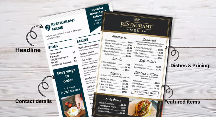
- Main headings: Section titles like “Appetizers,” “Entrees,” and “Desserts”
- Item names: Individual dish titles that capture customer attention
- Descriptions: Supporting text that explains ingredients and preparation methods
- Prices: Cost information is presented consistently throughout the menu
- Special callouts: Featured items, chef recommendations, or seasonal offerings
Secondary Elements:
- Individual dish names
- Price information
- Brief descriptions
Supporting Elements:
- Ingredients lists
- Dietary indicators (vegetarian, gluten-free)
- Chef recommendations
Use different font sizes, weights, and colors to establish this hierarchy. Your most profitable dishes should stand out visually from standard offerings.
2. Typography Excellence
Typography represents another essential element for restaurant menu design because it directly affects readability and customer experience. Moreover, proper font selection and implementation can enhance brand personality while ensuring accessibility for all customer demographics.
Font Selection Criteria
Choosing appropriate fonts requires balancing readability with aesthetic appeal and brand alignment. Therefore, successful menu designs incorporate fonts that support both functional requirements and visual identity goals.
Font Selection Considerations:
- Readability: Fonts must remain clear under various lighting conditions
- Brand alignment: Typography should reflect the restaurant’s concept and atmosphere
- Scalability: Fonts must work effectively at different sizes throughout the menu
- Accessibility: Consider customers with visual impairments or reading difficulties
- Cultural appropriateness: Fonts should match the cuisine type and the target audience
3. Layout and White Spacing
Effective layout and spacing represent fundamental essential elements for restaurant menu design because they determine how easily customers can navigate and understand menu offerings. Moreover, strategic layout decisions can guide customer attention toward profitable items while maintaining overall usability.
Grid Systems and Organization
Implementing consistent grid systems creates organized, professional-looking menus that facilitate easy navigation. Therefore, well-planned grids ensure proper alignment and spacing throughout all menu sections.
Grid System Benefits:
- Consistent spacing between all menu elements
- Proper alignment that creates a professional appearance
- Scalable layouts that work across different menu sizes
- Balanced compositions that distribute visual weight effectively
- Systematic organization that supports easy content updates
Section Division Strategies
Clear section divisions help customers quickly locate desired menu categories while preventing information overload. Additionally, strategic section organization can influence ordering patterns and increase average transaction values.
Effective Section Division Methods:
- Physical separators: Lines, borders, or graphic elements between sections
- White space: Strategic spacing that creates natural category boundaries
- Typography: Consistent heading styles that clearly identify sections
- Color coding: Subtle color variations to distinguish different categories
- Layout changes: Alternating layouts that create visual variety and separation
Flow and Reading Patterns
Understanding natural reading patterns helps optimize menu layouts for maximum effectiveness. Furthermore, strategic flow design can guide customers through logical ordering sequences that maximize both satisfaction and profitability.
Reading Pattern Optimization:
- Top-to-bottom flow for traditional Western reading patterns
- Left-to-right scanning for detailed information processing
- Center focus for featured items and special promotions
- Strategic placement of high-margin items in prime visual zones
- Logical progression from appetizers through desserts and beverages
Check out some menu layout templates and designs to ensure every detail and information is organized perfectly, like names, pricing, descriptions, ingredients, offers, and more.
4. Color Psychology to Influence Customers
Color selection ranks among the most essential elements for restaurant menu design because colors directly influence customer emotions and purchasing decisions. Moreover, strategic color application can enhance appetite appeal while reinforcing brand identity and creating memorable experiences.
Appetite-Stimulating Color Choices
Certain colors naturally stimulate appetite and encourage food consumption. Therefore, incorporating these colors strategically throughout menu design can positively influence customer ordering patterns and satisfaction levels.
Appetite-Enhancing Colors:
- Red: Increases appetite and creates urgency for special offers
- Orange: Promotes warmth and comfort, encouraging longer dining experiences
- Yellow: Stimulates happiness and appetite, particularly effective for breakfast items
- Brown: Suggests richness and indulgence, perfect for meat dishes and desserts
- Green: Indicates freshness and health, ideal for salads and vegetarian options
Effective color and typography for restaurant menu hierarchy help customers understand your menu’s organization at a glance. Therefore, different text sizes, weights, and styles should clearly distinguish between restaurant names, section headers, dish names, descriptions, and prices. This visual system guides readers through your content naturally.
5. High-Quality Imagery
Strategic use of high-quality imagery represents an essential element for restaurant menu design that can significantly impact customer ordering decisions. Moreover, professional photography and graphics can enhance appetite appeal while showcasing menu offerings effectively.
Professional Photography Standards
Investing in professional food photography can dramatically increase item sales when implemented strategically. Therefore, high-quality images must accurately represent dishes while making them appear as appealing as possible.
Photography Quality Requirements:
- Professional lighting that makes food appear fresh and appetizing
- Accurate color representation that matches the actual dish appearance
- Sharp focus that highlights key ingredients and textures
- Appropriate styling that enhances natural food appeal
- Consistent photography style throughout menu applications
Strategic Image Placement
Effective image placement maximizes visual impact while supporting overall menu design objectives. Additionally, strategic photo positioning can guide customer attention toward high-profit items and special offerings.
Image Placement Strategies:
- Feature photography for signature dishes and high-margin items
- Limit images to prevent overwhelming the menu design
- Position photos in prime visual zones for maximum impact
- Use images to break up text-heavy sections
- Ensure photos complement rather than compete with descriptions
Alternative Visual Elements
When photography isn’t feasible, alternative visual elements can enhance menu appeal and functionality. Furthermore, strategic use of graphics and illustrations can support brand identity while improving menu navigation.
Alternative Visual Options:
- Custom illustrations that reflect the restaurant’s concept and style
- Icons and symbols for dietary restrictions and special features
- Decorative elements that enhance brand identity
- Infographics that explain complex preparation methods
- Color-coded systems that improve menu navigation
To go beyond the basics and tailor your restaurant menu to specific needs, explore customizable menu templates that you can easily edit, and create a menu that reflects your brand identity.
6. Compelling Dish Descriptions
Menu descriptions serve as your primary sales tool, yet many restaurants underestimate their importance. Furthermore, well-crafted descriptions can increase item sales by up to 27% by creating appetite appeal and justifying prices through storytelling and sensory language.
Effective menu descriptions paint vivid pictures in customers’ minds using sensory words that trigger taste memories. Words like “crispy,” “tender,” “smoky,” “creamy,” and “rich” create immediate appetite appeal and help customers imagine flavors before ordering.
Additionally, sensory language makes dishes more memorable and increases customer satisfaction. Website testing, meetings, practices, and research about the site.
Sensory Description Categories:
- Taste descriptors: “smoky,” “tangy,” “rich,” “crisp,” “savory,” “sweet”
- Texture words: “tender,” “flaky,” “creamy,” “crunchy,” “silky,” “hearty”
- Aroma suggestions: “aromatic,” “fragrant,” “fresh,” “spiced,” “herbed”
- Visual elements: “golden,” “colorful,” “rustic,” “elegant,” “vibrant”
- Temperature indicators: “sizzling,” “chilled,” “warm,” “hot,” “cool”
7. Strategic Pricing Presentation
Pricing presentation represents one of the most critical essential elements for restaurant menu design because it directly impacts customer spending behavior and restaurant profitability. Moreover, strategic pricing display techniques can increase order values while maintaining customer comfort with their purchasing decisions.
Visual Pricing Techniques
How prices appear visually on menus significantly affects customer reactions and ordering decisions. Additionally, subtle presentation changes can reduce price resistance while maintaining transparency and building trust.
Follow these best practices for visual pricing:
- Remove dollar signs to minimize price focus during decision-making
- Align prices consistently for professional appearances
- Avoid highlighting prices with bold fonts or contrasting colors
- Integrate prices naturally within item descriptions
- Maintain readable font sizes that don’t create eye strain.
8. Seasonal and Special Item Presentation
Design your menu structure to accommodate seasonal changes and special promotions without requiring complete redesigns. Therefore, create flexible sections or insert areas where you can easily add limited-time offerings or seasonal specialties.
Use removable inserts or clip-on sections for daily specials or rotating items. This approach keeps your main menu current while allowing flexibility for chef specials or seasonal ingredients. Additionally, separate special sections create excitement and suggest freshness and innovation. Launching, and start running ads and shipping.
Wandering how you can craft the menu that contains all of these elements that make your restaurant stand out, use our online menu maker, which is easier to use, provides an intuitive design interface, and helps you create a menu for your restaurant with ease.
How Do Colors Make Your Restaurant Menu Design Shine?
Colors trigger brain responses that directly impact appetite and spending habits. Warm colors like red, orange, and yellow make people hungrier and create urgency. Therefore, successful restaurants use these colors strategically throughout their menus.
Red especially increases appetite and pushes quick decisions. However, too much red overwhelms customers and creates stress. Instead, restaurants should use red carefully to highlight special deals or signature dishes.
Blue suppresses appetite, and restaurants should generally avoid it. Nevertheless, blue works well for seafood places or when used sparingly as an accent color.
Color psychology in restaurant menus:
- Red: Increases appetite and urgency
- Orange: Stimulates hunger and friendliness
- Yellow: Creates happiness and energy
- Green: Suggests health and freshness
- Brown: Implies comfort and tradition
- Blue: Reduces appetite (use carefully)
Green connects with health and freshness, making it perfect for vegetarian options or farm-fresh concepts. Similarly, brown and earth tones suggest comfort and tradition, ideal for family restaurants or steakhouses.
Color contrast also plays a crucial role in readability. Additionally, a strong contrast between text and background ensures all customers can easily read your menu, including those with vision problems.
Which Font Choices for Menu Design Boost Sales and Keep Customers Happy?
Typography affects both readability and how customers see your restaurant. Clean, easy-to-read fonts encourage people to explore your entire menu. Conversely, hard-to-read fonts frustrate customers and make them stick to familiar items.
Sans-serif fonts work best for menu body text because they stay clear at different sizes. Popular choices include Arial, Helvetica, and Calibri.
However, serif fonts can work well for headers when used sparingly.
Font size guidelines for restaurant menus:
- Body text: At least 12 points
- Headers: 14 to 18 points
- Consider your customers’ age when choosing sizes
- Older customers may need larger text
Avoid using more than two different fonts in your menu design. Furthermore, keep everything consistent throughout your menu to look professional. Mixed fonts make your menu look messy and confuse customers.
Script fonts should rarely appear in menus. While they may look fancy, they often sacrifice readability for style. Therefore, save decorative fonts only for your restaurant name or special section headers.
How to Organize Information on a Restaurant Menu?
A well-organized menu is like a roadmap that guides your customers to their perfect meal. The way you arrange and present information can significantly impact what people order, how much they spend, and their overall dining experience.
1. Logical Menu Flow and Categories
Start with a Natural Progression: Organize your menu in the order that mirrors a typical dining experience. Begin with appetizers and small plates, move through soups and salads, then feature main courses, and conclude with desserts and beverages. This intuitive flow feels comfortable and familiar to diners.
Group Similar Items Together: Within each category, cluster similar dishes. For example, group all pasta dishes in one section, all grilled meats in another, and vegetarian options together. This makes it easier for customers with specific preferences or dietary restrictions to find what they’re looking for quickly.
Consider Dietary Preferences: Mark vegetarian, vegan, gluten-free, and other dietary options. You can use symbols, different fonts, or dedicated sections. This saves time for customers with restrictions and shows that your restaurant is inclusive and thoughtful.
2. Strategic Item Placement
Highlight Your Stars: Place your most profitable and signature dishes in prime real estate locations on the menu. The upper right corner and center of the page typically receive the most attention. These “golden triangle” areas should feature items you want to sell the most.
Use the “Anchor Effect”: Position one or two high-priced items near the top of each section. These expensive options make other menu items appear more reasonably priced by comparison, even if they’re still profitable for your restaurant.
Avoid the “Death Valley”: The bottom left corner of a menu gets the least attention. Don’t place items here that you want to sell frequently. Instead, use this space for basic information like hours of operation or your restaurant’s story.
3. Menu Formatting
Write Compelling Descriptions: Use sensory language that helps customers imagine the taste, texture, and aroma of dishes. Instead of “grilled chicken,” try “herb-crusted chicken breast with crispy golden skin.” Mention cooking methods, key ingredients, and flavors that make each dish special.
Keep Descriptions Concise: While detailed descriptions are important, avoid overwhelming customers with too much text. Aim for one to three lines per dish, focusing on the most appealing and distinctive elements.
4. Seasonal and Special Item Presentation
Create Flexibility for Changes: Design your menu system to accommodate seasonal updates easily. Consider using inserts, clip-on specials, or digital displays for items that change frequently. This keeps your regular menu stable while allowing for creative seasonal offerings.
Highlight Seasonal Items: Make seasonal specials stand out through special boxes, different colored text, or unique formatting. Use language that emphasizes freshness and limited availability, such as “while supplies last” or “featuring spring’s first asparagus.”
Tell the Seasonal Story: Connect seasonal items to their origins when possible. Mention local farms, seasonal harvests, or traditional preparation methods that tie to the time of year. This creates emotional connections and justifies premium pricing for special ingredients.
You can also include the same elements in menus with multiple languages. Here we’ve described multilingual menu design ideas that you must check out.
What Common Menu Design Mistakes Kill Restaurant Sales?
Here are seven critical mistakes that hurt your bottom line and how to fix them. As soon as we start the work, the faster we’ll get the result.
1. Overwhelming Customers with Too Many Choices
When you offer 50+ items, customers feel paralyzed by options. They spend too much time deciding, often choosing familiar dishes or leaving frustrated. Research shows that people make faster, happier decisions when they limit their choices.
How to fix it: Keep your menu focused. Offer 7-10 items per category maximum. This speeds up ordering and lets you perfect fewer dishes.
2. Using Tiny, Hard-to-Read Fonts
Squinting at microscopic text frustrates customers, especially older diners. When people struggle to read your menu, they order less or pick the first thing they can decipher clearly.
How to fix it: Use fonts sized 12-point or larger. Choose clean, simple typefaces like Arial or Times New Roman. Make sure there’s a strong contrast between text and background colors.
3. Hiding Prices or Making Them Hard to Find
When customers hunt for prices, they get annoyed. Some restaurants bury prices in small print or use confusing layouts. This creates negative feelings that hurt sales.
How to fix it: Place prices clearly next to each item. Use the same font size for prices as descriptions. Align prices consistently so customers can scan them easily.
4. Writing Boring, Generic Descriptions
“Grilled chicken breast” tells customers nothing exciting. Bland descriptions make delicious food sound ordinary. You miss chances to make mouths water and justify higher prices.
How to fix it: Use sensory words that paint pictures. Instead of “pasta with sauce,” write “hand-rolled linguine tossed in rich, herb-infused marinara with garden-fresh basil.” Keep descriptions under 25 words.
5. Poor Visual Organization and Layout
Cluttered menus with no clear sections confuse customers. When everything looks equally important, nothing stands out. Poor spacing and random placement make ordering feel like work.
How to fix it: Group similar items together with clear headings. Use white space to separate sections. Create a visual hierarchy with different font sizes and weights to guide the eye.
6. Ignoring Menu Psychology and Item Placement
Most customers scan menus in predictable patterns. They notice items in the top-right corner first, then move to the top-left. Restaurants that ignore this pattern waste prime real estate on low-profit items.
How to fix it: Place your most profitable dishes in the top-right and top-left corners. Put items you want to sell more in these “golden triangles.” Use boxes or borders to highlight signature dishes.
7. Forgetting About Mobile and Online Viewing
Today’s customers often view menus on phones before visiting or while ordering delivery. Tiny text and complex layouts that work on paper become unreadable on small screens.
How to fix it: Test your menu on different devices. Create a mobile-friendly version with larger fonts and simplified layouts. Consider separate designs for dine-in and online ordering.
Frequently Asked Questions
1. What’s the most important visual element when designing a restaurant menu?
The most crucial visual element is readability. Your menu should be easy to read in your restaurant’s lighting conditions, whether it’s dim candlelight or bright fluorescent bulbs. Choose fonts that are at least 12-point size for body text and ensure a strong contrast between text and background colors. Dark text on light backgrounds typically works best.
2. Where should I place my most profitable dishes on the menu?
Position your highest-profit items in the “golden triangle” – the upper right area of your menu where eyes naturally go first. Also, consider the top and center of each section. These prime real estate spots get the most attention. Use visual techniques like boxes, different fonts, or subtle highlighting to draw attention to these dishes. Avoid placing your star items in the bottom left corner, which gets the least attention.
3. What’s the best way to organize menu categories and sections?
Follow the natural flow of a meal: appetizers, soups/salads, main courses, desserts, and beverages. Within each section, group similar items together – all pasta dishes in one area, all grilled items in another. Create clear visual separation between sections using white space, lines, or different formatting. Consider your restaurant type: casual dining might benefit from “Shareable Starters” and “Comfort Classics,” while upscale establishments might use “First Course” and “Chef’s Specialties.”
4. What role does white space play in effective menu design?
White space is crucial for creating a clean, upscale appearance and preventing customer overwhelm. Don’t try to cram every inch of your menu with text or images. White space helps customers focus on individual items and makes your menu easier to scan. It also suggests quality – cramped menus often appear cheap or disorganized.
5. How often should I update my menu design, and what elements should change?
Update your core menu design every 2-3 years to keep it fresh, but make small seasonal adjustments more frequently. Change seasonal specials monthly or quarterly, but keep your signature dishes consistent – customers expect to find their favorites. Update prices annually or as costs change, and refresh descriptions if they become outdated. Consider redesigning when you rebrand, change your restaurant concept, or notice declining sales on certain items.
Conclusion on Essential Elements for Restaurant Menu Design
The essential elements for restaurant menu design work synergistically to create powerful business tools that drive customer satisfaction and profitability. Moreover, successful implementation of these elements requires balancing multiple priorities, including functionality, aesthetics, psychology, and business objectives.
Understanding and implementing these fundamental components enables restaurants to create menus that not only look professional but also generate measurable business results. Therefore, investing in strategic menu design optimization represents one of the most cost-effective ways to improve restaurant performance and customer experiences.
Most importantly, effective menu design serves as a bridge between restaurant offerings and customer desires, facilitating successful transactions while building lasting relationships. Additionally, menus that incorporate all essential elements create competitive advantages that support long-term business success and growth.