The rice topping menu template presents visual attraction through its design with a wood background and bold aesthetic elements. The relaxed rustic coloring scheme makes reading easier, yet bright colors alongside systematic sections deliver an interactive menu display to customers.
This rice topping menu template features a rich wood-textured background, adding depth and warmth to the design. The bold typography highlights key menu items, ensuring clarity, while the structured columns separate sections for easy navigation. This menu design blends aesthetics and function for a seamless dining experience.
What Makes a Rice Topping Menu Template Visually Appealing?
A quality rice topping menu template needs to display food choices, but it should also create an upgraded dining experience. Good visual presentation within the menu attracts guests, who can then effortlessly browse through the selections. The aesthetic, along with functional qualities of this menu are supported by multiple design elements.
1. Thoughtful Layout for Easy Navigation
The structure of a menu significantly impacts readability and user experience. A well-organized rice topping menu template follows a structured approach with:
- Clearly defined sections – Categories like classic toppings, premium selections, and combo meals are distinctly separated to prevent confusion.
- Logical flow of information – Items are arranged in a way that naturally guides the customer’s eye from one section to another.
- Strategic white space – Proper spacing between elements ensures that the menu looks clean and not overwhelming.
2. Eye-Catching Typography for Clarity and Style
The typeface selection in a menu establishes how customers both absorb and understand the information presented on the page. The rice topping menu template must contain three essential elements.
- Bold, legible fonts for headings – Using modern, clean typefaces makes category names stand out.
- Readable sans-serif fonts for menu items – Simple, clutter-free fonts ensure clarity.
- Consistent font hierarchy – Larger fonts for dish names, slightly smaller for descriptions, and the smallest for prices help maintain order.
3. Engaging Color Schemes and Visual Contrast
The colors used on a menu direct both emotional responses in customers and their level of hunger. Attractive rice topping menu templates should include:
- Warm and inviting tones – Shades of red, yellow, and orange can stimulate hunger.
- Dark backgrounds with bright accents – This combination enhances readability and adds a modern touch.
- Consistent branding – Colors align with the restaurant’s theme to create a cohesive experience.
4. High-Quality Food Images to Enhance Appeal
Visual food items become highly effective marketing tools. An outstanding rice topping menu template should contain the following elements:
- High-resolution images of signature dishes – Showcasing the most appealing options encourages customers to try them.
- Well-positioned images – Placing pictures near relevant menu sections without cluttering the layout maintains a professional look.
- Minimal but impactful visuals – Too many images can be overwhelming, so selective placement is key.
Which Layout Features Make a Rice Topping Menu Template Easy to Read?
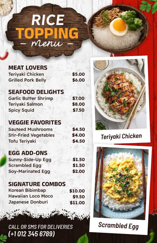
The image presents a food menu design for a rice topping menu template that excels both visually and structurally for improved clarity. The organized structure enables consumers to find their desired dishes faster without compromising an attractive, professional presentation. Key layout features include:
- Bold Yellow Headers: Brushstroke-style category labels create a striking contrast against the dark wood background, making sections easy to identify.
- Organized Spacing: Well-balanced gaps between menu items ensure a clutter-free presentation, allowing for effortless reading.
- Legible Sans-Serif Fonts: A clean and modern typeface enhances readability while maintaining a polished aesthetic.
- Right-Aligned Food Images: Placed beside text, these images add visual interest without overshadowing the menu details.
- Wood-Textured Background: The warm, rustic backdrop enhances the template’s appeal, giving it a natural and cozy feel.
- Contrast Between Text and Background: Lighter text against a darker base improves visibility, making the menu readable in various lighting conditions.
Each of these elements contributes to a visually balanced and user-friendly menu design, ensuring a seamless ordering experience.
How Icons and Symbols Enhance a Rice Topping Menu Template?
Icons and symbols improve the functionality and visual appeal of a rice topping menu template by making it more user-friendly and easy to navigate. Here’s how:
- Category Differentiation: While the menu relies on bold typography, icons could further separate meat, seafood, veggie, and egg add-ons, making it easier for customers to identify their preferences at a glance.
- Visual Interest: Small symbols such as chili icons for spice levels or a leaf for vegetarian options could add clarity without cluttering the layout.
- Enhanced Readability: A compact symbol next to food names—like a fish for seafood or an egg for add-ons—would improve quick scanning and selection.
- Branding Consistency: Incorporating unique icons that align with the rustic wood-themed aesthetic strengthens the restaurant’s identity while maintaining an inviting and professional design.
- Call-to-Action Support: The phone icon beside the delivery contact helps grab attention, reinforcing ease of ordering.
By integrating carefully placed icons and symbols, this rice topping menu template can become even more visually appealing and user-centric while maintaining its elegant and structured presentation.
Why is a Wood Background Effective in a Rice Topping Menu Template?
A wood background in a rice topping menu template adds warmth and authenticity, creating a visually inviting experience. The natural texture provides a rustic feel that aligns with traditional and comfort food themes. This blend of rustic charm and modern menu design ensures a refined, engaging, and user-friendly presentation.
Key Benefits of a Wood Background:
- Enhances Contrast – Dark or bold text stands out clearly against the textured surface, improving readability.
- Creates a Natural Ambiance – Evokes a fresh, organic dining experience that connects with the essence of rice-based dishes.
- Adds Depth to the Design – The wood grain pattern prevents the menu from looking flat, making elements more dynamic.
- Pairs Well with Bold Accents – Bright highlights or colorful dish images pop against the neutral wood tones.
A well-balanced wood background elevates the menu’s aesthetic while maintaining clarity and sophistication, ensuring a visually appealing and functional design.
Conclusion
A well-crafted rice topping menu template enhances both visual appeal and functionality, ensuring a seamless ordering experience with a structured layout, bold typography, and high-quality images. The warm wood background adds depth, while icons and symbols improve navigation and highlight key menu features. Together, these elements create an engaging menu that enhances the dining experience.