Valentine’s Day is the perfect occasion to craft a romantic dining experience, and this Valentine’s Menu Template adds a touch of charm and sophistication. With its elegant design and love-themed elements, this template is ideal for restaurants looking to captivate guests with a beautifully curated menu.
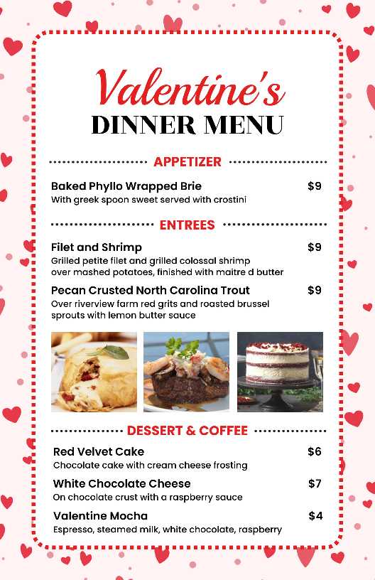
This charming Valentine’s Menu Template features a soft pink background adorned with delicate red hearts, setting a warm and inviting tone. The stylish mix of bold and script fonts highlights the romance of the occasion, while the dotted red border frames the menu elegantly. Sections are neatly structured, making showcasing appetizers, entrées, and desserts easy.
How This Charming Valentine’s Menu Template Win Hearts with Simplicity?
A well-designed Valentine’s menu doesn’t need excessive decorations to make an impact. This template embraces simplicity with a structured layout, making the menu items easy to read. The clear sectioning between appetizers, entrées, and desserts ensures an effortless browsing experience for diners.
- Minimalist Design: The dotted red border frames the menu without overwhelming the content.
- Balanced Font Usage: A mix of bold and script typography creates contrast while maintaining readability.
- Organized Sections: The structured categories help guests quickly scan their meal options.
Just like a creative appetizer menu design that entices guests with an elegant presentation of starters, this Valentine’s menu template uses simplicity and visual appeal to enhance the overall experience.
By keeping the design clean yet visually appealing, this Valentine’s menu template delivers a perfect balance of charm and sophistication.
What Makes the Romantic Aesthetic of This Charming Valentine’s Menu Template Stand Out?
A Valentine’s menu isn’t just about listing dishes—it’s about creating an atmosphere that enhances the dining experience. The romantic aesthetic of this Charming Valentine’s Menu Template is carefully designed to evoke feelings of love, warmth, and intimacy. From its color palette to its typography and layout, every element is thoughtfully crafted to capture the essence of Valentine’s Day.
1. The Power of a Thoughtful Color Palette
Colors influence emotions, and in a Valentine’s menu, they play a crucial role in setting the mood. This template uses a harmonious blend of soft pink, deep red, and white—each carefully chosen for its romantic symbolism:
- Soft Pink represents tenderness, affection, and warmth, creating a welcoming ambiance.
- Deep Red symbolizes passion, desire, and love, drawing attention to key elements like the menu title and category headers.
- White adds contrast and elegance, ensuring the overall design remains clean, readable, and sophisticated.
This well-balanced combination ensures that the menu feels both visually appealing and emotionally engaging, enhancing the overall dining experience. Whether designing a dinner menu template for an upscale event or a casual Valentine’s gathering, color harmony is key to creating the right atmosphere.
2. The Role of Decorative Elements in Enhancing Romance
Subtle yet strategic use of decorative details reinforces the Valentine’s theme without overwhelming the menu layout. Some of the standout elements include:
- Heart Motifs – Scattered lightly in the background, they add a playful yet elegant touch. Their placement is designed to subtly guide the reader’s eyes across the menu.
- Dotted Red Border – Frames the menu like a love letter, adding a touch of vintage romance and sophistication.
- Soft Gradients and Shadows – These elements create a sense of depth, making the text and images stand out beautifully.
By ensuring these details complement rather than dominate the design, the menu achieves a seamless blend of aesthetics and function.
3. Typography That Balances Romance and Readability
The choice of fonts contributes significantly to the romantic aesthetic of this menu. A combination of elegant script and bold serif fonts creates an appealing contrast:
- Romantic Script Font (for the title & key phrases) – The flowing, cursive typography used for “Valentine’s” adds a handwritten, intimate feel, resembling a love note.
- Bold Serif Font (for menu categories & dish names) – Ensures clarity and sophistication while maintaining easy readability, even in dim restaurant lighting.
- Subtle Italics (for descriptions) – Adds a gentle, poetic touch to descriptions, reinforcing the romantic storytelling aspect of the menu.
This mix of fonts keeps the menu looking charming and romantic while ensuring functionality and legibility. Similarly, in a coffee menu design, carefully selected fonts can enhance the cozy and inviting feel of a café’s offerings.
4. Structured Layout for a Seamless Experience
A well-organized layout is essential to guide diners effortlessly through the menu. This template follows a structured yet fluid design, allowing guests to focus on their meal selections without confusion. Key layout features include:
- Defined Sections – “Appetizers,” “Entrées,” and “Desserts” are neatly categorized, making it easy for guests to navigate.
- Balanced White Space – This avoids clutter and allows each menu item to stand out, contributing to an elegant, airy design.
- Strategic Use of Icons & Dividers – Small, subtle icons (such as tiny hearts) separate sections, maintaining the romantic aesthetic without overwhelming the menu.
This balance between visual appeal and functionality ensures that diners enjoy a smooth, immersive experience as they explore their meal options.
5. How This Design Enhances the Overall Valentine’s Experience
The goal of this Charming Valentine’s Menu Template is not just to showcase food but to create an emotional connection with diners. By weaving together:
- A romantic color palette that evokes warmth and passion.
- Decorative elements subtly reinforce the Valentine’s theme.
- Typography choices that blend elegance with readability.
- A structured, clutter-free layout for a seamless experience.
This template elevates the dining ambiance, making Valentine’s Day feel even more special and memorable for couples celebrating their love.
How Do Heart Motifs Add Charm to This Charming Valentine’s Menu Template?
Heart symbols are universally recognized as a representation of love, making them a natural and fitting design choice for a Valentine’s menu template. However, their placement and execution determine whether they enhance the design or overpower it. This template achieves the perfect balance by using heart motifs in a subtle yet effective way.
Creating a Playful Yet Elegant Atmosphere
The hearts are scattered across the background in a soft, flowing pattern, adding a sense of movement and liveliness. Just like a playful Valentine’s menu template, these elements introduce a fun yet sophisticated charm to the overall design.
Enhancing Visual Interest Without Distracting
While hearts are prominently featured, they do not dominate the layout. Instead, they function as an aesthetic complement that reinforces the theme without drawing attention away from the actual menu items.
Maintaining a Cohesive Theme
The combination of hearts and a dotted border creates a sense of harmony within the design. The hearts frame the menu rather than overwhelm it, ensuring that they contribute to the overall charm instead of cluttering the space.
By thoughtfully integrating heart motifs, this menu template successfully captures the romantic essence of Valentine’s Day, making it a delightful visual treat for guests.
Why Is Typography Elegance Key in a Charming Valentine’s Menu Template?
Typography is more than just a way to display words; it shapes the mood and character of the menu. In this Charming Valentine’s Menu Template, typography plays a dual role: enhancing the romantic aesthetic while ensuring clarity and readability.
How Typography Enhances the Valentine’s Theme
The choice of fonts and text styling directly contributes to the overall charm and elegance of the menu:
- Romantic Script Font for the Title – The flowing cursive script used for “Valentine’s” exudes elegance and captures the essence of love.
- Bold Serif Font for Readability – The structured serif typeface ensures that menu categories and item names remain prominent and legible.
- Consistent Font Sizes and Spacing – A well-balanced typographic hierarchy makes scanning the menu effortless, ensuring a smooth customer experience.
Typography Color Contrast for a Visually Appealing Look
Colors also play a key role in typography presentation:
- Red for Highlights & Headings – The rich red color draws attention to important sections, like category titles and prices.
- Black for Menu Items – Ensuring clarity and contrast against the soft pink background.
- Soft Shading for a Delicate Feel – Subtle effects make the text pop without overwhelming the design.
With its refined font choices, structured layout, and balanced color palette, this template ensures a perfect blend of elegance and readability.
Conclusion
This charming Valentine’s menu template perfectly balances romance and elegance, creating a visually appealing and functional design that enhances the dining experience. The soft pink background, complemented by delicate red hearts, sets a warm and inviting tone, while the mix of stylish fonts adds a touch of sophistication.