Picture this: you walk into a restaurant, and the first thing you notice isn’t the smell of delicious food or the cozy atmosphere – it’s the menu. The right color combinations and typography choice can not only make your menu look professional but also reduce confusion, boost takeout sales, and profitability.
In this comprehensive guide, we’ll dive deeper to unlock the psychology of effective colors and typography for menu design, transforming your menu from a simple list into a powerful marketing tool that drives sales and enhances your brand image.
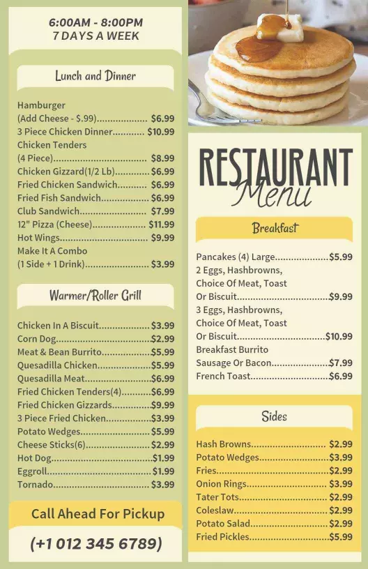
Sounds cool, doesn’t it? We’ve also got mouth-watering restaurant menu templates for you that will effortlessly elevate your menu design, making the process faster yet efficient.
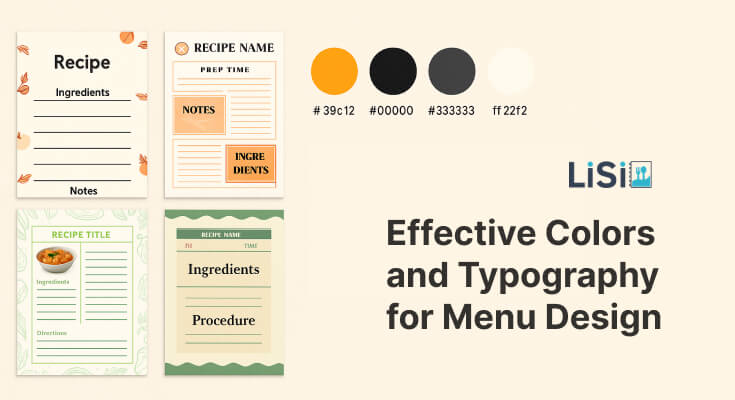
Why does color and typography matter in menu design?
The human brain processes visual information incredibly fast – in fact, it takes just 13 milliseconds to process an image. When customers glance at your menu, their first impression is formed almost instantly, and that impression is heavily influenced by color and typography choices.
Colors trigger emotional responses and can actually affect appetite. Warm colors like red and orange can stimulate hunger and create a sense of urgency, while cool colors like blue can suppress hunger but convey trust and reliability.
On the other hand, typography affects readability and sets the tone for your brand’s professionalism.
Here are the reasons why these factors have a huge impact on creating delightful design.
1. Impact on customer behavior
Research shows that well-designed menus can increase sales by up to 20%. Here’s how color and typography specifically influence customer behavior:
- Red increases appetite and creates urgency (think McDonald’s)
- Green suggests freshness and health (perfect for salad bars)
- Black conveys luxury and sophistication (high-end restaurants)
- Orange effects enthusiasm and affordability (casual dining)
2. Typography’s hidden power
- Easy-to-read fonts reduce decision fatigue
- Font size can guide attention to high-profit items
- Font personality reinforces brand identity
- Proper spacing prevents overwhelming customers
3. Brand recognition and memory
Consistent use of colors and fonts across your menu helps build brand recognition and trust. When customers see similar design elements in your marketing materials, social media, or even takeout packaging, they immediately connect them back to their dining experience.
This consistency builds trust and makes your restaurant more memorable in a crowded marketplace.
What colors work best for menu design?
There are certain types of colors you need to consider for better brand consistency. Let’s explore the proven color strategy to improve your menu’s impact.
| Colors | Type | Meaning | Best for |
|---|---|---|---|
| Red | Warm | This color is the king in attracting more eyeballs. It’s been proven to create a sense of urgency. Many giant fast-food brands like KFC, McDonald’s, and Pizza Hut have chosen this color for branding. | Fast-casual restaurants highlight daily specials, creating urgency around limited-time offers. |
| Orange | Warm | It combines the energy of red with the cheerfulness of yellow. It’s approachable, friendly, and suggests affordability without cheapening your brand. It works particularly well for family restaurants. | Family restaurants, breakfast spots, and casual dining chains. |
| Yellow | Warm | Perfect to grab the attention of viewers, but should be used sparingly as the main color, as it can strain the eyes when overused. Use this color to highlight special items or create visual breaks. | Highlighting specials, breakfast menus, and children’s menu sections |
| Blue | Cool | Health-focused restaurants, vegetarian/vegan establishments, organic food, and salad sections. | Seafood restaurants, beverage sections, conveying cleanliness and trust. |
| Green | Cool | It is perfect for restaurants emphasizing health, freshness, and sustainability. It’s naturally associated with vegetables, organic food, and environmental consciousness. It works exceptionally well for salad bars and vegetarian restaurants. | Health-focused restaurants, vegetarian/vegan establishments, organic food, salad sections. |
Black and White | Natural | This classic combination never goes out of style. Black text on white background offers the best readability, while black backgrounds with white text can create a sophisticated, upscale feel. | These evergreen combinations work for virtually any restaurant type and allow accent colors to pop. |
| Purple | Cool | While purple can suggest luxury and creativity, it’s not naturally associated with food and can actually suppress appetite. Use it sparingly and only if it aligns with your brand identity. | Health-focused restaurants, vegetarian/vegan establishments, organic food, and salad sections. |
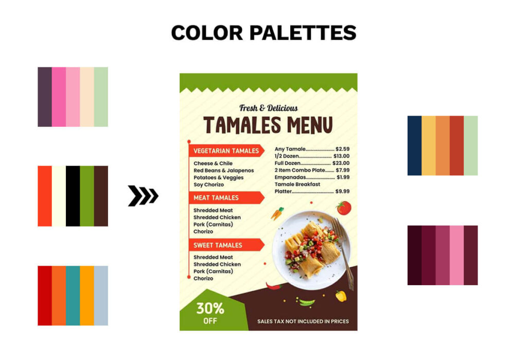
You can even try different color palettes or a cohesive color scheme to make your menu appear more upscale and trustworthy.
Make sure you’re well-known in color psychology because it plays an important role in creating a brand identity and elevating offerings.
Additionally, using accent colors to highlight promotional offers and consistent colors to create a memorable brand experience can encourage customers to make purchasing decisions and increase the retention rate.
What typography works the best for menu design?
Let’s cover how the typography and font-family you choose to describe anything can change the look of the menu completely.
Here are some best fonts you can try to give an authentic look to your menu, and improve readability.
| Fonts | Meaning | Best for |
|---|---|---|
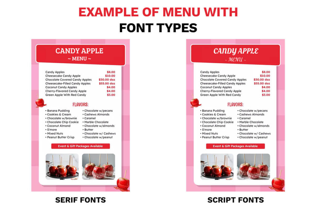
| Serif fonts | These fonts are known for their small decorative lines at the end of characters. They’re traditionally associated with reliability, tradition, and formality. | Fine dining restaurants and traditional events. |
| Sans-Serif | Without decorative strokes, the modern appearance of these fonts makes them easier to read and perfect for digital displays. | Casual dining, fast-casual restaurants, modern establishments, and digital menus |
| Script Fonts | Script fonts mimic handwriting and can add personality and warmth to your menu. However, they should be used sparingly and only for headers or special sections, never for body text. | Restaurant names, section headers, special occasion messaging |
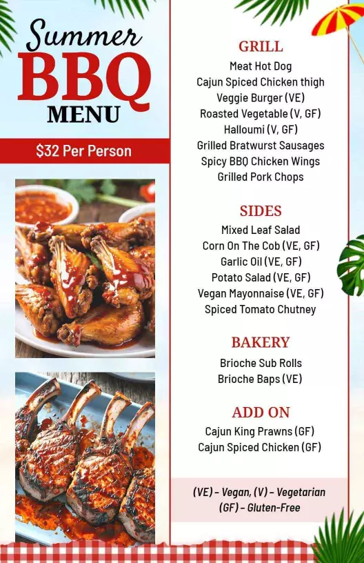
| Slab Serif Fonts | With a bold style and strong personality, use Slab serif fonts to enhance the menu design and create an excellent contrast that’s easy to read from a distance. | Ideal for BBQ, breweries, and meat-catering restaurants. |
Best practices for typography
Font Size Guidelines: It’s essential to follow the guidelines for font size. Effective typography starts with appropriate sizing that prioritizes readability across all contexts. Keep the font size in pixels for headlines, body content, and paragraphs for sufficient contrast to create a clear hierarchy
Moreover, the most important information should be the largest and boldest, with supporting details progressively smaller. Use consistent patterns so readers know where to look.
Readability: Choose legible fonts over decorative ones. Ensure sufficient contrast between text and background. Use appropriate sizes – minimum 12pt for body text, larger for headlines. Maintain adequate line spacing (1.2- 1.5x font size).
Consistency: Typography should reinforce your brand personality. Never use more than 3 font styles, and stay consistent with that style.
Spacing: Keep decent spacing between the headlines, paragraphs, menu items, and images to ensure better reliability. Also, a good font size, and white space between sections help customers navigate without feeling overwhelmed.
How to pair the best colors and fonts on a menu that suits your brand?
The colors and fonts you choose to design a menu can make a big difference in how customers feel about your restaurant. Here’s how to get it right.
1. Match the color to your brand
It’s all about branding, so ensure that the color you choose matches the vibe and your restaurant’s personality. Whether it’s classy, fun, modern, or cozy, use colors that reflect that mood. Below are some best colors that might suit your restaurant style.
- Fine Dining: Use deep, rich colors like dark red, gold, navy blue, or black. These give a high-end feel.
- Casual or Family-friendly: Warm and friendly colors like orange, yellow, or soft green work well.
- Trendy or Modern: Going with combos like black and white with a pop of bright color (like teal or coral).
- Health-focused or organic: Use natural colors like green, brown, or beige. These give your menu a fresh look.
Pro tip: Using various colors for creative menu design can spoil the viewer’s experience. Stick to 2–3 main colors that go well together and reflect your brand.
2. Choose the best fonts
There are many types of fonts available online, but choose the one that people love to read, especially when they are hungry and want to order fast.
- For headings (like categories): Choose a bold, stylish font that matches your brand. This is where you can show more personality.
- For menu items and descriptions: Use a simple, clean font. Sans-serif fonts like Arial, Helvetica, or Open Sans work well.
Avoid hard-to-read script fonts for menu descriptions and item names. They look pretty but can be confusing, especially in low lighting.
Tip: Use no more than two fonts—a stylish one for titles and a clean one for text.
3. Use contrast for easy reading
It’s recommended to maintain a 3:1 minimum ratio between text and background colors to ensure better accessibility and readability.
- Dark text on a light background is the easiest to read.
- Light text on a dark background can work, but be careful—it’s harder to get right.
- Don’t use similar colors for text and background (like light gray on white).
Tip: If you print your menus, always test them in real lighting conditions at your restaurant.
4. Keep it consistent
Once you pick your colors and fonts, use them throughout the entire menu. This makes your menu look neat and professional. Also, try to match your menu style with your website, signs, and social media handles.
These tips will help you design a great menu that evokes feelings of hunger, desire, and craving in customers.
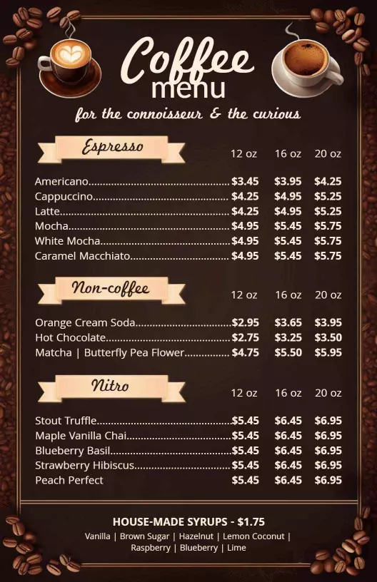
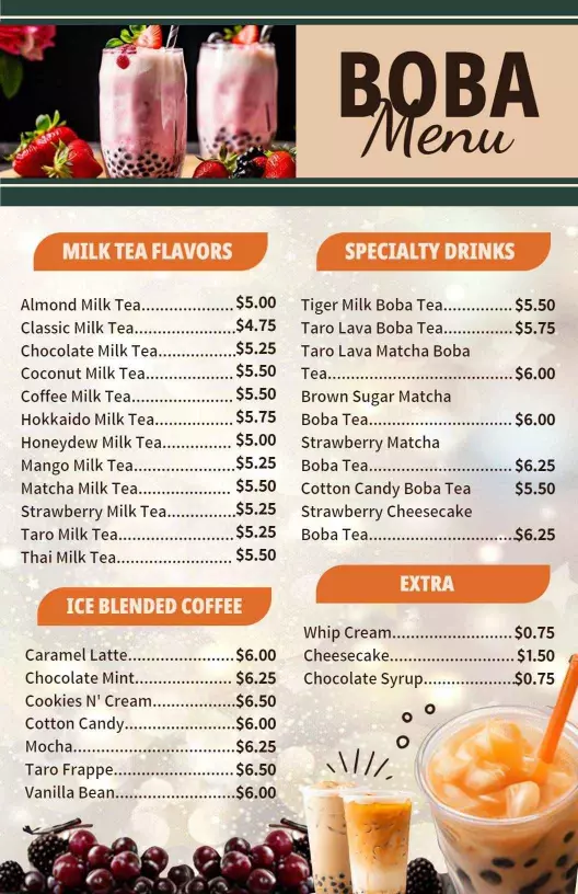
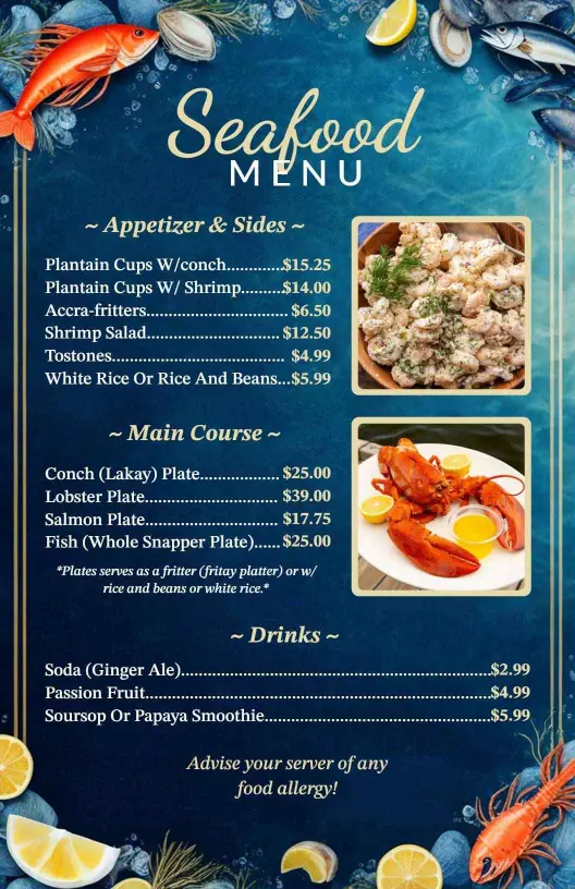
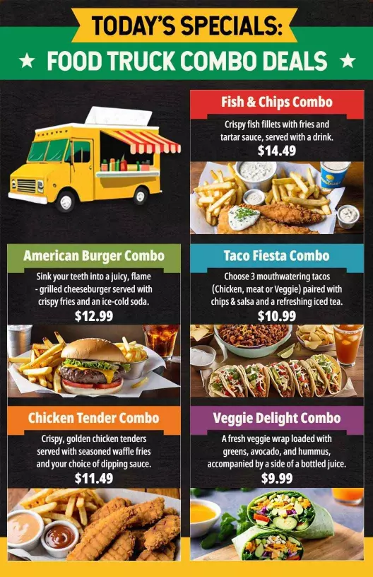
Examples of menus with the best colors and typography
Whether you’re running a cafe, food truck, bar, restaurant, or other, and are confused about which colors and font pairs should you choose that get better results, below are some examples of menus that follow the practices of color and typeface pairings.
To streamline the menu design process and make it easier, you can head on to the menu creator that will help you create a menu for any style, and give a hint for effective colors, typography, elements, and more.
And the best part is that you can easily customize these templates by adjusting colors, modifying fonts, adding a logo or other elements, and changing food photographs.
Bottom words
Did you know that the colors and typography you choose for the menu have the power to influence emotions?
Choosing effective colors and typography for the menu can enhance your brand, improve customer experience, and ultimately drive sales.
Creating an effective menu design isn’t just about making something that looks pretty – it’s about creating a strategic tool that enhances your brand, improves customer experience, and ultimately drives sales.
The colors and typography you choose have the power to influence emotions, guide decision-making, and create lasting impressions.
Frequently asked questions
1. What’s the biggest mistake restaurants make with menu typography?
Using typography that is too small or decorative for body text. If customers can’t easily read your menu, they’ll get frustrated and may order less or leave altogether. Always prioritize readability over style for menu item names and descriptions.
2. Should I use different colors for different menu categories?
Keep in mind that a consistent color scheme reinforces brand identity, and it’s recommended to use 2 to 3 colors only to make your menu visually appealing. Use warm colors for main items, cool colors for desserts, and neutral colors for appetizers.
3. Which fonts make food sound more appetizing on menus?
The selection of fonts and colors lies in your restaurant category. For instance, Script or handwritten-style fonts in the menu are perfect for cafes, and combining fonts with distinct characteristics, on the other hand, are perfect for fast-food stalls. You can also try A/B testing to decide which font and color combinations can increase order value.
4. What colors should I avoid in menu design?
Avoid overly bright neon and harsh combos like red text on green background. You can try different color palettes for menu design that reflects your restaurant’s culinary theme.
5. Should digital menus use different color and typography strategies than print menus?
Yes. Digital menus often require brighter colors and higher contrast due to screen glare. Fonts should be optimized for readability across devices, especially mobile. Also, warm colors become even more important for digital menus.