A well-designed taco menu template can significantly enhance your restaurant’s presentation, making it easier for customers to explore their options.
This bold taco menu template offers an organized structure and a clean layout that you can customize easily with menu maker and provide a seamless ordering experience.
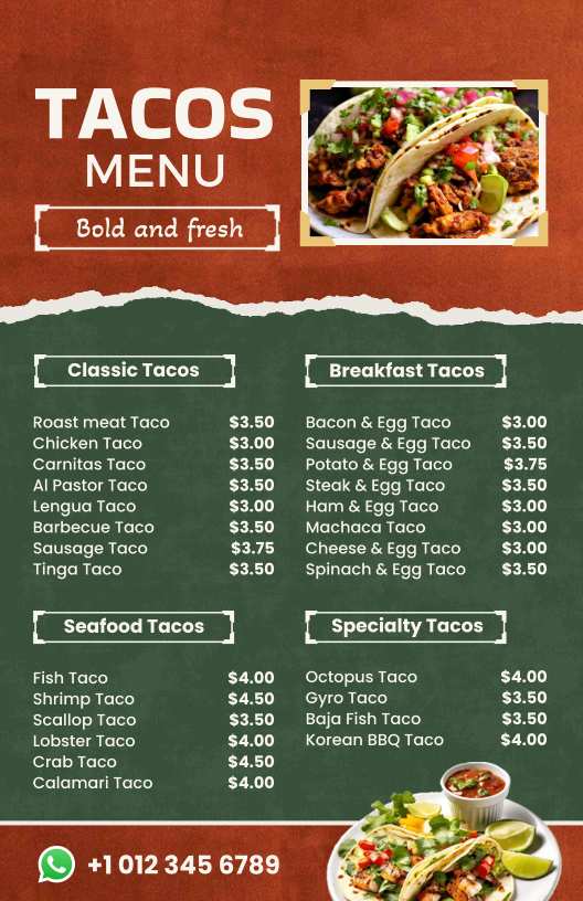
The template features a striking contrast of deep green and textured rust-brown background, giving it a rustic yet modern look.
The bold and fresh heading immediately captures attention, while the boxed sections with clear borders separate different taco categories like Classic, Breakfast, Seafood, and Specialty Tacos.
The easy-to-read sans-serif font ensures clarity and makes decision-making quick and effortless.
Moreover, you can explore and customize more menu templates here related to tacos, food trucks, and more.
What Are the Key Design Elements of This Bold Taco Menu Template?
Creating an engaging and visually appealing taco menu requires a thoughtful combination of typography, color psychology, imagery, and layout.
A well-designed menu not only enhances the dining experience but also influences purchasing decisions by making dishes look more appetizing and exciting.
1. Bold Typography for Maximum Impact and Readability
Typography plays a crucial role in guiding customers’ eyes through the menu while reinforcing the brand’s personality. The Bold Taco Menu Template utilizes:
- Large, uppercase fonts for headings – These ensure that section titles stand out, making it easy for customers to quickly find different categories like “Classic Tacos” or “Seafood Tacos.”
- A contrasting yet readable font for descriptions – A clean, sans-serif typeface is used for food descriptions to maintain clarity without overpowering the menu’s aesthetic.
- Strategic font pairing – The combination of decorative and modern typefaces adds a trendy and authentic touch, reflecting the vibrancy of Mexican cuisine.
2. Eye-Catching and Appetite-Stimulating Color Scheme
Color psychology is crucial in menu design because colors influence emotions and appetite. This template strategically employs:
- Deep Red: Known to stimulate hunger and evoke passion, red creates a sense of excitement and energy, making dishes feel more appetizing.
- Earthy Green: Symbolizing freshness, quality, and organic ingredients, green reassures customers of the natural and wholesome flavors of the tacos.
- Neutral White and Beige Accents: These provide balance, ensuring text remains legible while preventing visual fatigue. The neutral tones also help maintain a clean, upscale look.
By combining warm, bold colors with natural hues, the menu enhances the rustic yet modern aesthetic, making it both appealing and easy to read.
3. High-Quality Food Photography for Visual Appeal
People eat with their eyes first, and well-placed, high-resolution images significantly impact ordering behavior. This menu template strategically incorporates:
- A large, central taco image at the top – Serving as a visual hook, this photo instantly grabs attention and sets the tone for an appetizing experience.
- Additional smaller images subtly placed – These reinforce the restaurant’s commitment to quality and freshness while maintaining an organized layout.
- Professional lighting and vibrant colors in food photography – The bright and crisp taco images make each ingredient stand out, enticing customers to try new dishes.
4. Decorative Frames and Borders for a Premium Feel
To add structure and a touch of sophistication, this menu includes:
- Geometric borders and rustic-inspired elements enhance the theme without overwhelming the design.
- Subtle shadowing and layering create a sense of depth, making the layout feel more dynamic and engaging.
These design details ensure that the menu looks polished, cohesive, and visually striking, reinforcing the restaurant’s brand identity.
5. Layered Background for Depth and Texture
A simple, flat design can sometimes feel uninspiring. To create a sense of dimension and authenticity, this template integrates:
- A textured, torn-paper effect that divides sections naturally while adding a handcrafted aesthetic.
- Subtle background patterns evoke rustic Mexican culture, making the menu feel more immersive and thematic.
This layered approach keeps the design visually interesting without cluttering the space, making it both functional and artistic.
6. Strategic Layout and Organization for Easy Navigation
An effective menu design ensures customers can quickly locate their desired items without confusion. This template excels in structure through:
- A grid-based system – This ensures each section is neatly arranged, reducing clutter.
- Ample spacing between items – Prevents overwhelming the reader and enhances clarity.
- Clear section dividers – These help differentiate between menu categories, making it easy for customers to scan and choose their orders.
By combining bold typography, strategic color choices, high-quality imagery, elegant decorative elements, and a well-organized layout, this taco menu template not only enhances visual appeal but also drives better customer engagement and increased sales.
Why This Bold Taco Menu Template Is Perfect for Showcasing Your Best Dishes?
A great menu not only lists food items but also enhances customer engagement. These simple menu designs appealingly showcase dishes, ensuring a pleasant and easy ordering experience. This template is designed to:
Categorize Dishes for Easy Navigation
- Headings separate different taco varieties, making it easy for customers to explore options.
- Specialty tacos get a dedicated section to stand out.
Highlight Signature Items for More Sales
- The top image draws attention to the best-selling tacos.
- The “Specialty Tacos” section features unique, premium selections like Korean BBQ and Octopus Tacos.
Display Pricing Transparently
- Prices are aligned neatly next to item names, ensuring clarity and easy comparison.
Allow Flexibility for Customization
- The structured layout makes it simple to add special offers, limited-time dishes, or chef’s recommendations without disrupting readability.
By strategically categorizing items and using a visually engaging format, this template makes it easy for customers to quickly find their favorites while discovering new options.
How Does This Bold Taco Menu Template Help You Create a Professional Look?
A professional menu should be organized, easy to navigate, and visually appealing. This template ensures credibility and elegance through:
Well-Structured Sections for Easy Browsing
The menu is divided into clear categories:
- Classic Tacos – Featuring traditional favorites.
- Breakfast Tacos – A unique morning selection.
- Seafood Tacos – Showcasing fresh, coastal flavors.
- Specialty Tacos – Highlighting premium and innovative options.
Consistent Font Pairing for Elegance
- The combination of bold uppercase headings and readable sans-serif text enhances legibility while maintaining a cohesive design.
Balanced Text and Spacing
- Proper alignment ensures the menu looks clean and polished, preventing overcrowding while maintaining a structured layout.
Prominent Contact Information for Convenience
- A visible WhatsApp ordering option makes it easy for customers to place orders, enhancing convenience.
Visually Engaging Headings for Branding
- The tagline “Bold and Fresh” reinforces the restaurant’s brand identity while drawing attention to the high-quality ingredients used.
By implementing clean, modern, and structured design elements, this template helps create a professional, easy-to-read, and aesthetically appealing taco menu.
What Role Do Color and Layout Play in This Bold Taco Menu Template?
The combination of color psychology and structured layout design plays a crucial role in making this classic takoyaki menu template both appealing and functional. Here’s how:
Color Psychology and Its Impact on Customers
- Deep Red for Appetite Stimulation – The red background subconsciously stimulates hunger, making customers more likely to crave tacos.
- Earthy Green for Freshness and Authenticity – The dark green elements evoke fresh ingredients, organic appeal, and authenticity, reinforcing the quality of the dishes.
- Neutral White for Clarity – White is used for text to enhance readability and create balance, ensuring that the menu does not feel overwhelming.
Layout and Readability Enhancements
- Grid-Based Alignment for Orderliness – The structured arrangement ensures that each section is neatly aligned, making the menu visually balanced and easy to read.
- Bold Headings and Subcategories – The strong, uppercase fonts for section titles contrast with the smaller, more delicate font for item names, creating a clear hierarchy of information.
- Spacing and Margins for a Clean Look – Ample white space around text prevents clutter and allows the eye to flow naturally from one section to another.
- Image Placement for Maximum Impact – The hero image at the top sets the tone, while the secondary image at the bottom reinforces the quality of the food. This well-balanced approach keeps the layout visually appealing and engaging.
Conclusion
An effective taco menu template enhances the dining experience, influences customer choices, and strengthens brand identity.
With bold typography, vibrant colors, high-quality imagery, decorative elements, and a structured layout, this template creates an engaging, professional, and easy-to-navigate menu.
The right design ensures your restaurant is more appealing and memorable to customers.